Monochrome Tiles: One Colour Family, Every Room in Your Home
Loading designs...
-
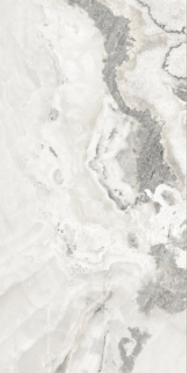
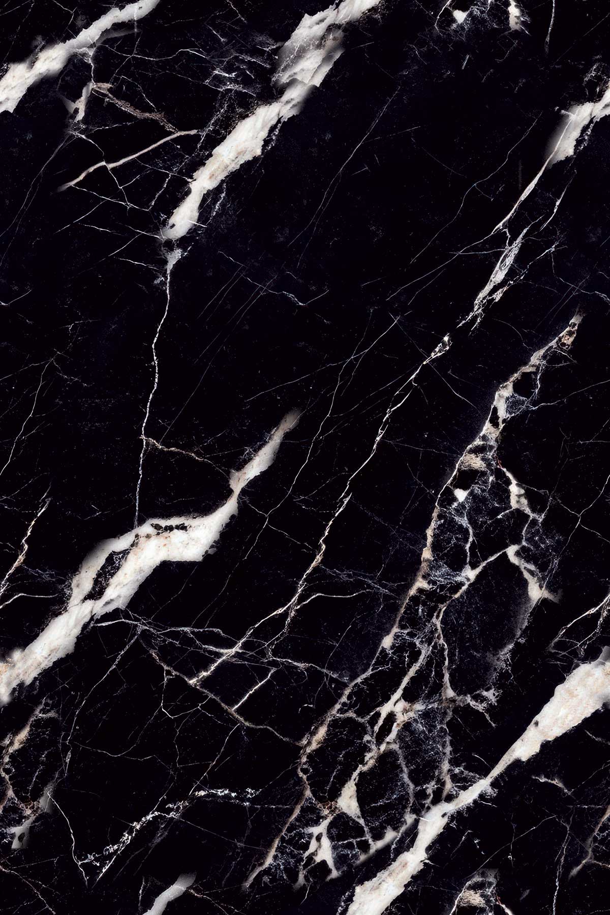
Cotto Sealine Black 800x1200GHR -
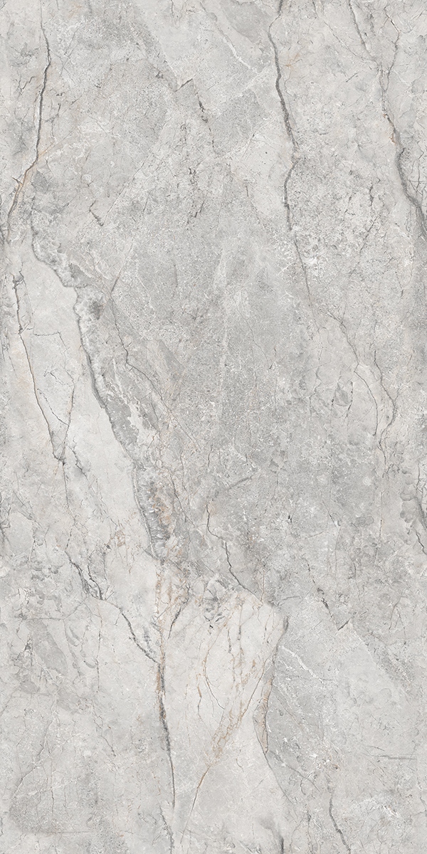
Cotto Sealine Cement 800x1200GHR -
Cotto sealine crema 800x1200GHR -
Cotto Sealine Kota 800x1200GHR -
Cotto Sealine Mocha 800x1200GHR -
Cotto Sealine Terracotta 800x1200GHR -
Cotto Sealine Crema (800x1600) 800x1600GHR -
Cotto Sealine White 800x1200GHR -
Cotto Sealine Musterd 800x1200GHR -
Cotto Sealine Black (800 x 1600) 800x1600GHR -
Cotto Sealine Kota (800x1600) 800x1600GHR -
Cotto Sealine Mocha (800x1600) 800x1600GHR -
Cotto Sealine Musterd (800x1600) 800x1600GHR -
Cotto Sealine Terracotta (800x1600) 800x1600GHR -
Cotto Sealine White (800x1600) 800x1600GHR -
ANJC-COTTO SEALINE KOTA 800x1600GHR -
ANJC- COTTO SEALINE MOCHA 800x1600GHR -
ANJC- COTTO SEALINE MUSTERD 800x1600GHR -
ANJC- COTTO SEALINE TERRACOTTA 800x1600GHR -
ANJC- COTTO SEALINE WHITE 800x1600GHR


")


")
")
")
")
")
")


Monochrome tiles are tiles where the entire design, whether plain, textured, or patterned, stays within a single colour family. The word monochrome means one colour, which in tile design means using the tints, shades, and tonal variations of a single hue rather than mixing multiple colours. A monochrome tile scheme could be all-grey, all-white, all-cream, all-charcoal, all-blush pink, all-sage green, or any other hue, as long as every tile in the space comes from the same colour family. Black and white is the most commercially well-known version of this look, but it represents only one variant within a much wider category.
The defining quality of a monochrome tile design is that the interest comes from tonal variation, texture, surface finish, and pattern within a single hue rather than from contrast between different colours. A bathroom tiled entirely in varying shades of grey from pale silver-grey walls to mid-grey floors reads as monochrome. A kitchen backsplash in a mix of light sage and deep forest green within the same green family is monochrome. A living room feature wall in deep charcoal with a carved relief pattern is monochrome. What they share is that a single hue controls the palette from floor to ceiling, and the visual depth comes from how that hue is used across different tones and surfaces.
Monochrome tiles on TilesFinders span every body type, including GVT, PGVT, ceramic, porcelain, and full body, and cover every room application from bathroom walls and kitchen backsplash to living room floors, bedroom feature walls, outdoor porch cladding, and commercial lobbies. Prices range from Rs. 35 per sq.ft for small-format ceramic monochrome wall tiles to Rs. 120 per sq.ft for large-format GVT or PGVT monochrome floor and wall tiles in premium designs.
What Makes a Tile Design Monochrome
Monochrome is a design philosophy, not a product category or body type. Any tile of any body type can be part of a monochrome design as long as it stays within one colour family. The three elements that define monochrome tile design are:
- Single hue: all tiles in the scheme belong to the same colour family. White and off-white is one family. Grey and charcoal is one family. Blush and terracotta is a borderline family where the hue shifts enough that it may cross from monochrome into tonal contrast. Strictly, black and white tiles are only monochrome if used as a tonal pair within the same achromatic (no-colour) family, which is how it is most commonly applied.
- Tonal variation: depth comes from light and dark variations within the hue, not from introducing a second colour. A pale grey wall tile paired with a mid-grey floor tile and a dark charcoal skirting is monochrome. Adding a beige tile to that scheme breaks the monochrome because beige is a warm-toned neutral, not a grey-family tone.
- Finish and texture as design tools: in a monochrome scheme, finish differences carry a lot of the visual work. A matte wall tile next to a glossy floor tile in the same grey creates contrast and definition without using a second colour. Textured, carved, or 3D surface tiles within a monochrome palette add shadow and depth that plain tiles in the same colour cannot.
The difference between monochrome and a plain single-colour tile scheme is that monochrome actively uses tonal range, finish variation, and sometimes pattern within the hue to build a complete interior, while a plain scheme uses one flat colour across all surfaces without tonal development. Grey tiles is an example of a colour category that naturally lends itself to monochrome design because the grey palette spans pale silver-grey to deep charcoal, giving a wide tonal range within a single hue.
Colour Families Used in Monochrome Tile Design
Every colour can produce a monochrome tile scheme when used across its full tonal range. The most common monochrome tile colour families in the Indian residential and commercial market are:
| Colour Family | Tonal Range Used | Popular Room Application | Common Finish Pairings |
| Black and White (Achromatic) | Pure white through mid-grey to deep black | Bathrooms, kitchens, entryways, powder rooms | Glossy white walls, matte black or grey floors |
| All-Grey | Pale silver-grey through mid-grey to charcoal | Living rooms, bathrooms, commercial lobbies | Matte walls, Posh or GHR floors |
| All-White and Off-White | Pure white through ivory to warm off-white | Bathrooms, kitchens, living rooms | Glossy or PGVT polished walls, matte floors |
| Cream and Beige | Light cream through warm sand to deep tan | Bedrooms, living rooms, pooja rooms | Matte or sugar finish throughout |
| Pastel Blush and Pink | Pale blush through dusty rose to soft terracotta | Bedrooms, powder rooms, cafes | Sugar or matte finish on walls, matte floors |
| Sage and Green | Pale mint through sage to deep forest green | Kitchens, bathrooms, boutique interiors | Matte and GHR finish |
| Powder Blue and Navy | Pale powder blue through mid-blue to deep navy | Bathrooms, kitchens, Moroccan-style interiors | Glossy walls, matte or GHR floors |
| Warm Terracotta and Rust | Pale sand through warm terracotta to deep rust | Entryways, outdoor walls, pooja rooms | Matte and GHR finish |
| Charcoal and Dark Neutrals | Mid-grey through anthracite to near-black | Living rooms, hotel lobbies, commercial | Matte or Posh floors, PGVT walls |
Among these, the all-grey and black-and-white achromatic families are the most widely specified in Indian residential builds. Pastel monochrome in blush, sage, and powder blue is the fastest-growing segment in the contemporary apartment and boutique interior category. For buyers building a monochrome scheme around white specifically, the full range of white tile tones from pure white through off-white to warm ivory is covered in white tiles, which addresses how lighting conditions shift the perceived tone of white tiles in Indian rooms.
How Finish and Texture Build Depth in a Monochrome Scheme
Because monochrome design restricts the colour palette, the visual work that colour contrast does in a multi-colour scheme must be handled by finish variation, surface texture, and pattern within the single hue. This is what separates a well-executed monochrome interior from a flat, featureless single-colour room.
- Gloss and matte contrast: placing a glossy wall tile against a matte floor tile in the same hue creates a clear surface boundary between the two planes without introducing a second colour. In a grey bathroom, pale grey PGVT in Polished High Glossy on the walls against a mid-grey matte GVT on the floor gives the room definition entirely through finish contrast within the grey family.
- Textured and 3D surfaces: a carved or relief-surface tile in the same colour as surrounding plain tiles creates shadow lines and depth under directional lighting. A charcoal matte wall with carved geometric relief next to a plain charcoal floor reads as visually rich without using a second colour.
- Tonal stepping: moving deliberately from the lightest tone of a colour on the ceiling and upper walls to a mid-tone on lower walls and a dark tone on the floor grounds the room and gives it a sense of weight. This is called tonal stepping and is one of the most effective techniques in monochrome interior design.
- Pattern within the hue: a printed Moroccan or geometric design using two tones of the same colour, such as pale grey and mid-grey, is still monochrome because both tones belong to the same colour family. This is where monochrome patterned tiles, monochrome geometric tiles, and monochrome Moroccan tiles fit; the pattern is built from tonal variation within a single hue, not from colour contrast.
Grout colour is as important as tile finish in a monochrome scheme. Matching grout to the tile surface makes a monochrome floor or wall read as a continuous plane. Contrasting grout, even in a slightly different shade within the same hue, emphasises the individual tile and gives the grid pattern more presence. In an all-grey bathroom, pale grey grout with mid-grey tiles gives a seamless look; charcoal grout with the same mid-grey tiles makes the grid bold and intentional. For buyers comparing finish options across the full tile range beyond monochrome specifically, matte finish tiles cover how matte reads across different colour families, including its specific advantage in monochrome schemes where it reduces glare and gives depth to dark tones.
Monochrome Tiles by Body Type
| Body Type | Wall Use | Floor Use | Common Sizes | Best Monochrome Application | Price Range (sq.ft) |
| Ceramic | Yes | 300x300mm dry light-traffic floor only | 200x200, 300x300, 300x600 | Budget bathroom walls, kitchen backsplash, pastel monochrome wall tiles | Rs. 35 to Rs. 60 |
| GVT | Yes | Yes (matte or GHR for wet areas) | 600x600, 600x1200, 800x1600 | Monochrome living room floors, large bathroom walls, carved feature walls | Rs. 50 to Rs. 110 |
| PGVT | Yes (only) | Never | 600x600, 600x1200, 800x1600 | High-gloss monochrome bathroom walls, reception cladding, bedroom feature walls | Rs. 60 to Rs. 120 |
| Full Body | Yes | Yes (matte or GHR) | 600x600, 600x1200, 800x1600 | Monochrome kitchen floors, stair tiles, outdoor monochrome porch | Rs. 60 to Rs. 115 |
| Porcelain | Yes | Yes (matte only) | 200x200, 300x300, 400x400 | Small-format monochrome bathroom floors, pastel accent floors | Rs. 40 to Rs. 85 |
Note: PGVT monochrome tiles are wall-only regardless of colour family or tonal design. Monochrome gloss tiles must not be used on bathroom floors, kitchen floors, or any wet or outdoor surface. For monochrome wet area floors, use matte or GHR finish in GVT, full body, or porcelain body types.
Where Monochrome Tiles Work in Indian Homes
- Monochrome Bathrooms: The bathroom is where Indian buyers most commonly apply monochrome design. A full grey bathroom with pale grey ceramic walls, mid-grey GVT floor, and dark charcoal grout is a monochrome scheme. An all-white bathroom with white PGVT walls in Polished High Glossy, white matte GVT floor, and white epoxy grout is a monochrome scheme. The key is that every surface stays within the chosen colour family; the visual interest comes from finish contrast between the wall gloss and floor matte.
- Monochrome Kitchen Tiles: Monochrome kitchen designs in India typically focus on the backsplash and floor. An all-cream backsplash in 300x600 mm ceramic with a warm ivory or beige kitchen floor is monochrome within the cream-beige family. A charcoal kitchen floor with dark grey backsplash and black hardware is a dark-neutral monochrome scheme. Gloss or semi-gloss finish on monochrome kitchen walls makes cleaning easier; matte works better on monochrome kitchen floors.
- Monochrome Living Room Floors: A single-family tonal floor in a living room, all-grey concrete look in 600x1200 mm matte GVT or all-cream limestone look in 600x1200 mm Posh finish, is one of the most refined and commercially popular floor aesthetics in Indian apartments. The monochrome floor lets furniture, lighting, and accessories provide colour without the tile competing with them.
- Monochrome Bedroom Feature Walls: Monochrome bedroom walls in blush, sage, dusty blue, or warm cream tones using PGVT in Polished High Glossy or GVT in carving finish are used for headboard feature walls. The single-hue approach means the wall has presence without contrasting sharply with the rest of the bedroom, making the transition from sleeping area to the rest of the room more gradual and restful.
- Commercial and Hospitality Spaces: Hotel lobbies, boutique cafes, office reception areas, and boutique retail interiors in India use monochrome tile schemes extensively because the look reads as deliberate, considered, and premium without requiring complex tile coordination. A charcoal lobby floor with a mid-grey reception wall cladding in the same tile range from the same manufacturer gives a commercially sophisticated result.
Monochrome Patterned Tiles: Geometric, Moroccan, and Mosaic
Within the monochrome category, patterned tiles use two or more tones from the same colour family to build a print, rather than using a single flat tone. This is distinct from multi-colour patterned tiles, where different colours are used in the design.
- Monochrome Geometric Tiles: Repeating geometric shapes such as hexagons, diamonds, and chevrons printed in two tones of the same colour. A pale grey and mid-grey hexagon print, or a cream and warm sand chevron, are monochrome geometric patterns. Available in GVT and porcelain in 300x300 mm and 600x600 mm.
- Monochrome Moroccan Tiles: Moroccan and Spanish-inspired patterns using two tones within a single colour family. A pale powder blue and deep navy Moroccan print is a monochrome Moroccan tile. An off-white and ivory encaustic motif is also monochrome Moroccan. These are digital print designs on ceramic or GVT bodies, not individually shaped tiles.
- Monochrome Mosaic Tiles: A mosaic-look digital print using tonal variation within a single hue on a standard tile body. Available in GVT and ceramic in 300x300 mm and 300x600 mm. Darker and lighter tones of the same colour simulate the individual tesserae of a traditional mosaic without the installation complexity of actual mosaic tile work.
Buyers who want the decorative complexity of a Moroccan or geometric print without restricting themselves to a single colour family will find the broader range of multi-colour patterned options under decor tiles, which covers decorative tile designs in both single-hue and multi-colour palettes.
Monochrome Tiles in Indian Interiors: Tonal Design for Every Budget
The monochrome design approach works across every budget tier in the Indian market because it is defined by design intent rather than by material cost. An all-white bathroom in 300x600 mm ceramic glossy at Rs. 28 per sq.ft is a valid monochrome scheme. So is an all-grey bathroom in 600x1200 mm PGVT Polished High Glossy at Rs. 100 per sq.ft. The design principle is the same; only the body type and size differ. This flexibility makes monochrome one of the most practically accessible design approaches for Indian residential projects, from builder-grade apartments to premium custom homes.
Morbi and Gujarat manufacturers produce monochrome tiles across the full colour family and body type range. All-grey GVT in matte or Posh finish in 600x1200 mm from Morbi manufacturers at Rs. 55 to Rs. 100 per sq.ft accounts for the largest share of monochrome tile sales in Indian urban residential projects. Pastel monochrome in blush, sage, and powder blue in 300x600 mm ceramic from Gujarat factories at Rs. 35 to Rs. 55 per sq.ft is the fastest-growing monochrome tile segment in the Indian market, reflecting increasing uptake of single-hue colour design in Indian contemporary apartments and boutique commercial spaces.
Browse Monochrome Tiles by Colour Family, Finish, and Room
Monochrome tiles span every colour family from all-white and all-grey to pastel blush, sage, and warm cream, across GVT, PGVT, ceramic, full body, and porcelain body types in sizes from 200x200 mm to 800x1600 mm. Browse the full monochrome tile catalogue from verified Morbi and Gujarat manufacturers on TilesFinders to compare colour family, tonal range, finish, size, and price before placing an order.


FAQs
Monochrome in tile design means using tiles from a single colour family across a room, with visual depth coming from tonal variation, finish contrast, and texture within that one hue rather than from mixing multiple colours. It does not mean black and white only. An all-grey room, an all-cream room, an all-blush room, or an all-charcoal room are all monochrome if they stay within one colour family throughout.
No. Black and white is one well-known version of monochrome design, where the achromatic colour family (white, grey, and black) is used across a room. Any other single colour family can also produce a monochrome scheme: all-cream, all-sage, all-terracotta, all-powder-blue, or all-charcoal are all valid monochrome approaches. The defining rule is that every tile in the scheme belongs to the same colour family.
A plain single-colour tile uses one flat, uniform shade across an entire surface. A monochrome scheme actively uses tonal variation within a colour family, finish contrast between surfaces, and sometimes pattern or texture within the hue, to build a visually complete interior. Monochrome is a design system involving multiple tones of one colour, while plain single-colour tiling uses one shade only.
Yes, with the correct body type and finish. GVT and full body monochrome tiles in matte or GHR finish are suitable for wet bathroom floors. PGVT monochrome tiles in any polished finish are for bathroom walls only, never floors. Ceramic monochrome tiles are wall-only except 300x300 mm for light-traffic dry bathroom floors. For any monochrome bathroom floor, use matte or GHR finish in GVT or porcelain.
All-grey (pale silver to charcoal) and all-white to off-white are the most widely used monochrome colour families in Indian homes. Cream and warm beige work well in bedrooms and living rooms under warm LED lighting. Pastel sage and powder blue are popular in contemporary Indian kitchens and bathrooms. Warm terracotta and rust tones are used in entryways and outdoor wall cladding. The choice depends on the room's natural light, the LED colour temperature, and the furniture and fitting finishes in the space.
Monochrome tiles in India range from Rs. 35 per sq.ft for small-format ceramic wall tiles in pastel or neutral tones to Rs. 120 per sq.ft for large-format 800x1600 mm GVT or PGVT monochrome floor and wall tiles in premium designs. All-grey GVT in 600x1200 mm matte from Morbi manufacturers is priced at Rs. 55 to Rs. 100 per sq.ft, the most commonly specified monochrome tile in Indian residential projects. Prices vary by colour family, body type, finish, size, and order quantity.
Yes, as long as the print uses only tones within a single colour family. A Moroccan-look tile printed in pale grey and dark grey is monochrome. A geometric tile in cream and warm sand is monochrome. A mosaic-look tile in light sage and deep sage is monochrome. The pattern becomes non-monochrome when it introduces a second, distinct colour family into the design, such as grey and gold or blue and white, where both colours are clearly distinct hues.