Abstract Tiles: Where Art Meets Architecture
-
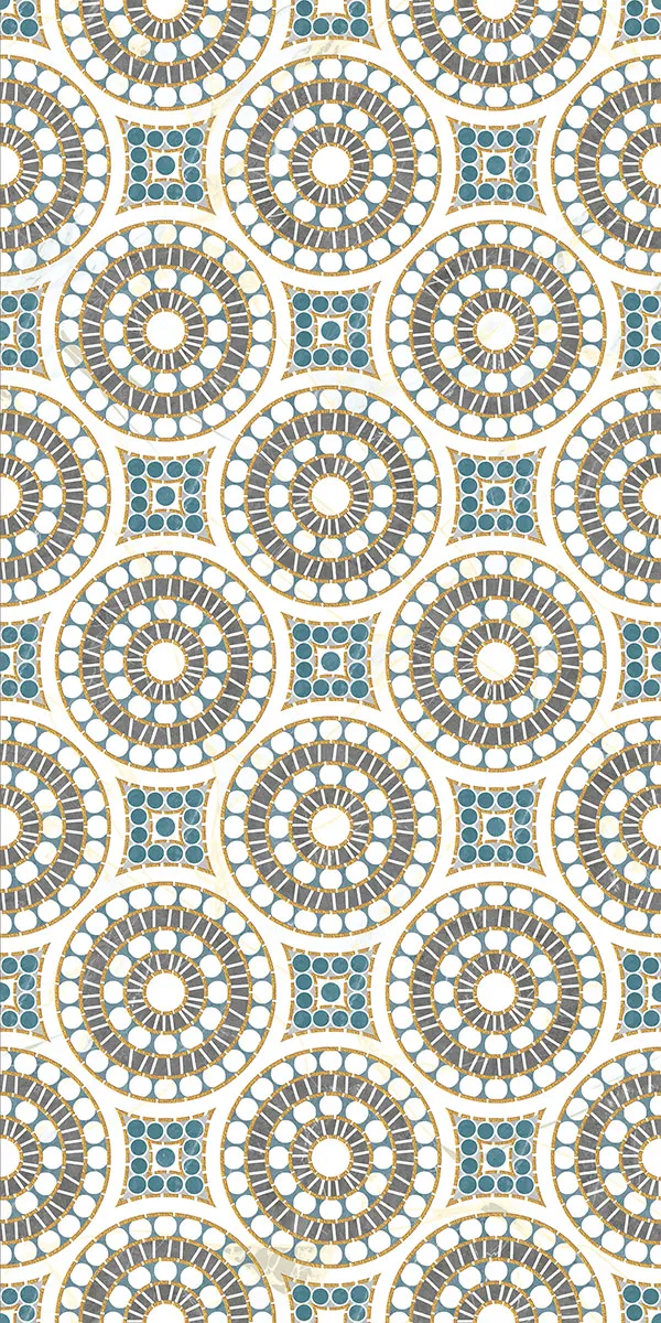
 3066
3066 -
 Aqua Gold Decore
 -
 3102 B
 -
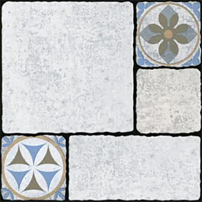
 KDT 209
 -
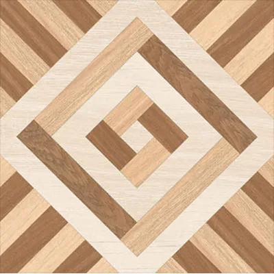
 Magic 006
 -
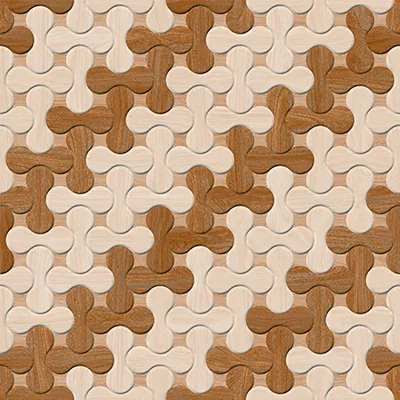
 Maker 135
 -
 Zic Zak 01
 -
 Aqua Gold Decore
 -
 Beton Gris Decor
 -
 3066
3066 -
 Crystal 001
 -
 P 2903
 -
 KDT 209
 -
 81046(61090)
 -
 313
313 -
 115003
 -
 115007
 -
 222002
 -
 331002
 -
 51078
51078
Tired of the Grid?
Real talk, the standard tile grid is safe… but sometimes “safe” is just code for boring. If every wall looks like a spreadsheet, where’s the soul? The drama? The mood?
Abstract tiles flip the script. They don’t imitate flowers, stone, or real-life objects. They splash, swirl, zig-zag, fracture, and float like emotions frozen in ceramic.
They’re expressive, imperfect, and unapologetic. And the real magic? Everyone sees something different. You might see waves in a blue splatter tile. Someone else might swear it looks like a storm. That’s the beauty of abstraction. The tile becomes the conversation.
Abstract tiles ditch uniformity and treat your wall or floor like a canvas. You’re not placing tiles… you’re placing art.
Setting the Stage: Abstract as the Lead Actor (Colour Strategy)
Abstract tiles don’t join the colour palette; they define it. The room orbits around them. They’re the lead actor; everything else is the supporting cast.
A. The Monochromatic Foundation
Think soft greys, creams, foggy taupes, abstract, but subtle. These are perfect for adding a strong pop:
- Mustard Yellow cabinet
- Emerald Green basin
- Indigo accent chair
The tile stays calm → the decor gets to shine.
B. The Muted Chorus
Now reverse it. If your abstract tile is bold, colourful, wild? Surround it with ultra-neutrals so the space doesn’t look like a carnival:
- Warm white walls
- Off-black lighting
- Sand-beige flooring
Key takeaway: Abstract tiles bring energy; the rest of the room brings balance.
Grounding the Art: Contrasting the Smooth and the Structured (Material Pairing)
Design isn’t just visual, it’s tactile. Abstract tiles shine when they’re paired with opposite textures. It’s like styling clothes: denim + silk always hits harder than denim + denim.
A. Slick vs. Gritty
Use a glossy, chaotic abstract tile right next to raw concrete or micro-cement.
Smooth vs. rough.
Shimmer vs. matte.
Chaos vs. calm.
This contrast makes both materials look 10x richer.
B. Warmth vs. Flow
Match flowing abstract lines (like ink, waves, or fluid strokes) with the straight vertical grain of wood. Perpendicular textures give instant, intentional drama.
C. Aged Elegance
Deep teal or charcoal abstract tile + aged brass or copper hardware? a chef’s kiss. The patina + the imperfect strokes give full Wabi-Sabi luxury.
The Architect’s Sleight of Hand: Mixing Patterns & Mastering the Glimpse
Good design isn’t about choosing plain or patterned, it’s about setting up the perfect balance. With plain tiles as the calm foundation, even a small glimpse of pattern becomes a moment of intentional drama.
A. The Terrazzo Bridge
If your abstract feature wall feels too loud next to wooden flooring, consider using small-chip terrazzo as a transitional element. It’s neutral, textured, and blends everything without stealing attention.
B. The Grout as Co-Creator
With abstract tiles, grout isn’t something to hide. Use contrast grout to outline the shapes and turn your wall into a stained-glass moment.
- White tile + Black grout = graphic art
- Blue tile + Grey grout = depth
- Cream abstract + Terracotta grout = earthy luxe
C. The Art Niche
Don’t want to commit to a full wall? Hit them with the sneak-attack placement:
- Shower niche
- Kitchen shelf backdrop
- Fireplace surround
- Stair risers
- Bathroom walls as highlighters (not full coverage)
- Shoe rack/entry storage backdrop (to visually separate it from the living space)
A glimpse of abstract is sometimes more powerful than a whole room of it.
D. The Visual Pathway (Commercial Design Trick)
In restaurants, cafes, and hospitality spaces, abstract tiles are often used as visual pathways—a continuous strip or band that subtly guides movement through the space. Instead of full-floor coverage, a patterned tile belt is introduced between neutral flooring to create direction, rhythm, and flow.
This technique helps define circulation routes, highlight key zones, and add character without overwhelming the interiors. It’s a functional design disguised as art.
Presence: How Abstract Tiles Command a Space
Abstract tiles respond to how they’re used in a space; their impact depends on where and how they appear, not just what they are.
Statement Surfaces
Use abstract tiles as murals. One uninterrupted surface becomes the artwork itself. These applications feel bold, immersive, and architectural. Perfect for:
- Living room feature walls
- Hotel-style bathrooms
- Massive entrance foyers
- Wash basin back wall
- Bedroom wall behind the bed (headboard wall)
Textural Accents
Here, abstract tiles work like texture rather than artwork. From a distance, they soften the space; up close, they reveal detail and craftsmanship. Ideal for:
- Shower floors
- Backsplashes
- Accent strips
- Powder rooms
The Mood: Light, Space & Emotion
Abstract tiles don’t just decorate; they manipulate the room.
- Movement: Fluid inks and splashes create motion. The eye glides across the wall instead of stopping.
- Spatial Perception: Non-repetitive patterns trick the brain into thinking the space is bigger because there’s no predictable grid.
- Colour Psychology: Soft, washed-out abstracts give spa vibes and relaxation. In contrast, High-contrast geometrics provide the feel of creativity, focus, and energy.
Abstract tiles quite literally change how a room feels the moment you enter.
Bodies, Materials, Sizes: Your Practical Toolkit
Abstract is a design, not a body type. You’ll find them in everything:
- Ceramic → walls
- Porcelain/Vitrified → floors, bathrooms
- Glazed vitrified → heavy-traffic areas, Suitable for all areas
Sizes range from:
- Square: 300x300 mm, 600x600 mm, 400x400 mm
- Recatgular: 300x600 mm, 600x1200 mm, 1200x2400 mm slab
- Other sizes: 300x450mm,1200x1800 mm
Choose based on the scale of design and the desired mood.
Matte: The Most Common Surface for Abstract Tiles
Most abstract tiles are available primarily in matte finishes. This is because abstract designs rely on surface variation, depth, and controlled texture rather than shine. Matte surfaces allow manufacturers to create multiple surface effects, such as soft grains, subtle reliefs, and layered finishes, which suit abstract patterns far better than high-gloss surfaces.
As a result, matte finishes not only dominate the abstract tile category but also deliver better visual balance, reduced glare, and a more refined architectural look.
Your Final Canvas: Signing Off on Originality
Abstract tiles aren’t just decor, they’re self-expression. They turn floors into stories, walls into emotions, and rooms into galleries. No two eyes see them the same way, and that’s exactly the charm. If you want your home to feel personal, artistic, and deeply intentional, abstract tiles are your signature.
Ready to create your own visual language?
Let the pattern pick you.
FAQs
Nope. While they shine in modern and contemporary spaces, abstract tiles can elevate classic interiors too, especially when used as a feature wall or paired with neutral surroundings.
Yes, but it depends on the tile body and surface finish. Porcelain or vitrified abstract tiles with matte or grip-friendly finishes are suitable for floors. The design alone doesn’t decide durability.
Most abstract designs actually hide minor stains, water marks, and daily wear better than plain glossy surfaces, especially in matte or textured finishes.
Absolutely. Abstract doesn’t mean loud. You’ll find elegant neutrals like greys, beiges, ivories, and charcoals with subtle movement and depth.
No special tools, but layout planning matters. Dry-laying helps understand pattern flow, alignment, and visual balance before final installation.