Bookmatch Tiles: Bookmatched Porcelain Slabs and Large Format Tiles for Indian Interiors
Loading designs...
-
7002 600x1200Glossy -
ASTILA 600x1200Glossy -
VIVANTA CREMA 600x1200Glossy -
ART 45 400x400Matte -
ART 46 400x400Matte -
ADDISON BROWN 1200x1800Glossy -
MARMO BRECCIA BEIGE 1200x1800Glossy -
MARMO BRECCIA GREEN 1200x1800Glossy -
VICTORY WHITE 1200x1800Glossy -
ADDISON BROWN 1200x1800Glossy


Bookmatching is one of the most visually dramatic techniques available in tile and stone surface design. The term comes from the practice of opening a book: when a stone slab is cut, and the two faces are opened side by side like the pages of a book, the grain pattern on the left face is a perfect mirror image of the right face. Placed together on a wall, the two faces create a symmetrical, continuous pattern that reads as a single composed surface rather than two individual tiles. In natural stone, this effect is achieved by physically cutting and repositioning adjacent slabs from the same block. In GVT and porcelain tiles, the same mirror effect is achieved digitally: the surface design on one tile is generated as a digital mirror of the adjacent tile, so the veining, grain, or pattern continues and mirrors across the joint when the tiles are placed side by side. Among the marble look tiles, the range from Morbi, bookmatched large-format porcelain tiles and slabs are the most premium and most visually impactful product direction available.
The result of bookmatching is a wall panel that looks like it was cut from a single enormous slab of stone. The mirrored veining creates symmetrical compositions across the wall surface: where a non-bookmatched marble-look tile has veining that runs in a general direction without relating to the adjacent tile, a bookmatched tile creates patterns that meet at the joint and form larger compositions. Specific names describe the visual results of particular bookmatching patterns: the butterfly, where the mirrored veining forms symmetrical wing-like forms; the cathedral, where the mirroring creates tall arched forms suggestive of Gothic vaulting; and the flame, where bold diagonal veining mirrors to create a flame-like pointed composition. Each of these emerges from the book-matching of the specific surface design on the tile.
This page covers bookmatch tiles from every angle: what the technique achieves and how it is produced in GVT and porcelain from Morbi, the tile formats and slab sizes where bookmatching is most effective, the marble-look and stone-look designs that work best as bookmatched compositions, the wall and floor applications, the precision installation requirements that bookmatching demands, and the grout specification that makes the mirror effect most complete.
How Bookmatching Works in GVT and Porcelain Tiles
In the GVT and porcelain tile production process from Morbi, bookmatching is achieved through digital surface design paired with matched production sequencing. The tile surface design (the marble veining, stone grain, or abstract pattern) is printed in pairs: tile A has the original design orientation, and tile B has the digitally mirrored version of the same design. When tiles are packaged and sold as a bookmatcuhed pair, each carton contains the A and B variants in alternating sequence so the installer can place them correctly.
The installer places the tiles in an A-B sequence along the wall: tile A, then its mirror tile B, then A again, then B. The joint between A and B is where the mirror effect occurs: the veining on the right side of tile A meets the mirror-image veining on the left side of tile B, creating the symmetrical composition at every joint across the wall. Getting this right requires that the installer follow the sequence precisely and align each tile exactly, because the mirror effect only works when the left edge of one tile meets the right edge of its mirror partner at the joint.
A-B / A-B layout: The standard bookmatching layout. Each pair of tiles (A and B) mirrors across the joint between them. Across a wide wall, the pattern repeats with a new mirror at every A-B joint. This creates a rhythmic, repeating mirror pattern across the full wall surface.
A-B / B-A layout: A more complex bookmatching arrangement where the second pair is reversed. This creates a four-tile repeat where the pattern mirrors in both directions, creating a more complex symmetrical composition across the full panel. The A-B / B-A layout requires four tiles to complete one full repeat rather than two, and creates a more elaborate visual result than the standard A-B layout.
Why Large Format Is Essential for Effective Bookmatching
The visual impact of bookmatching is directly proportional to the size of the tile or slab being bookmatched. A 300x600mm bookmatched tile creates a mirror composition only 600mm wide at each joint. From the normal room viewing distance of 2 to 4 metres, this 600mm composition is too small to read as a dramatic design statement. The mirror effect exists, but the composition is too narrow to create the visual impact that makes bookmatching a sought-after tile direction.
A 1200x2400mm slab creates a mirror composition 2400mm wide at each joint. From the normal room viewing distance, a 2400mm bookmatched composition spans a significant portion of the visible wall and creates a full, dramatic symmetrical panel that reads as a completely designed surface. The butterfly wing, cathedral arch, or flame pattern in a 2400mm-wide bookmatched composition is visible and legible from across the room in a way that the same pattern in a 600mm composition is not.
| Tile/Slab Size | Mirror Width at Joint | Visual Reading | Recommended Application | Category |
|---|---|---|---|---|
| 600x1200mm | 1200mm across the mirror | Bookmatching is visible but subtle at room distance | Bathroom feature wall in a compact bathroom, where full-wall coverage creates the effect | Large format tile |
| 800x1600mm | 1600mm across the mirror | Clear bookmatching composition visible from a distance | Bathroom feature wall, bedroom headboard wall, narrow lobby panel | Large format tile |
| 1200x1800mm | 1800mm across the mirror | Strong bookmatching composition; slab-quality visual result | Full bathroom wall, hotel room feature wall, living room panel | Slab |
| 1200x2400mm | 2400mm across the mirror | Maximum bookmatching impact; full wall composition visible from across the room | Hotel lobby wall, premium bathroom full wall, living room feature wall | Slab |
Bookmatched Marble-Look Tiles and Slabs
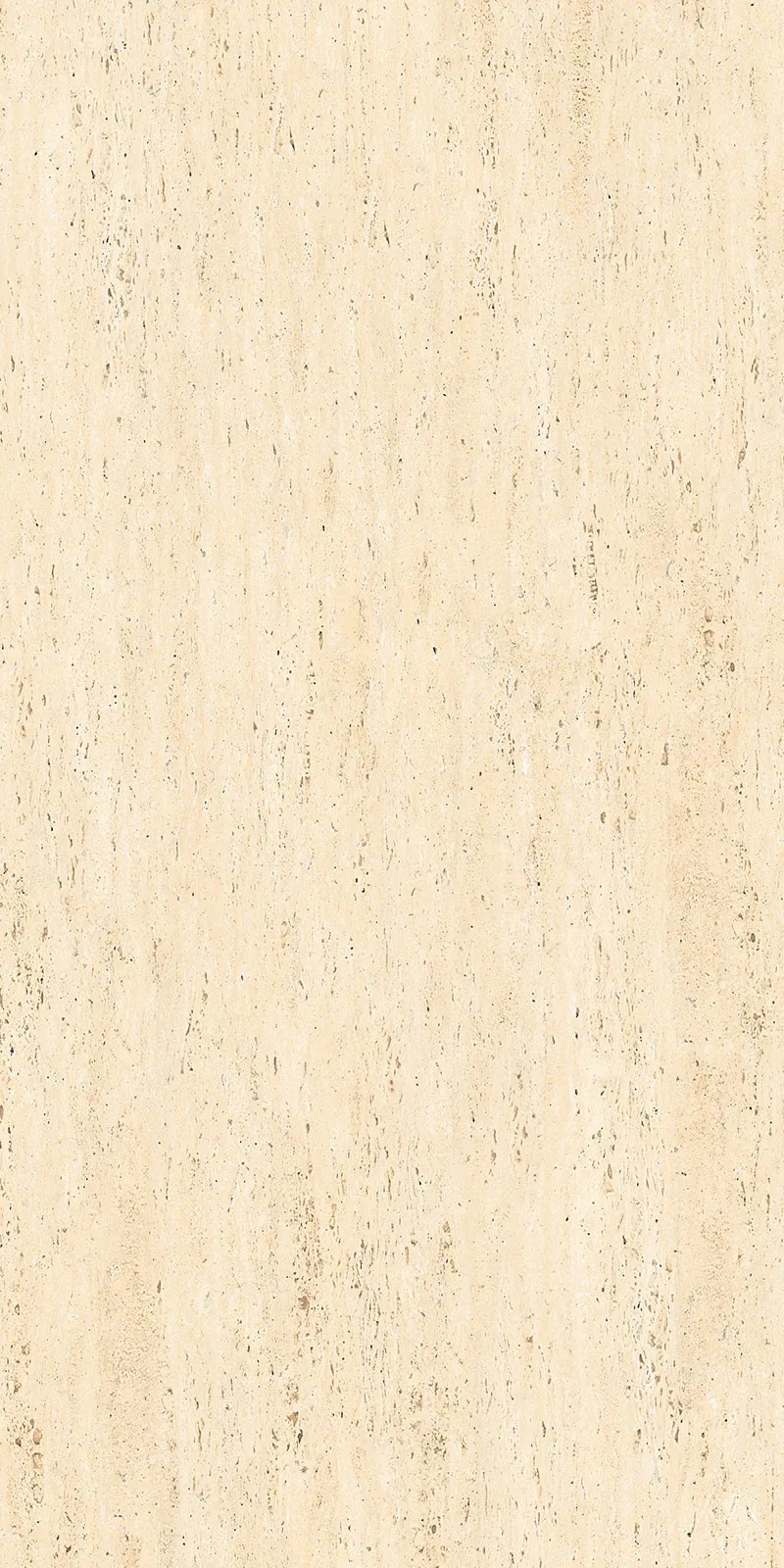
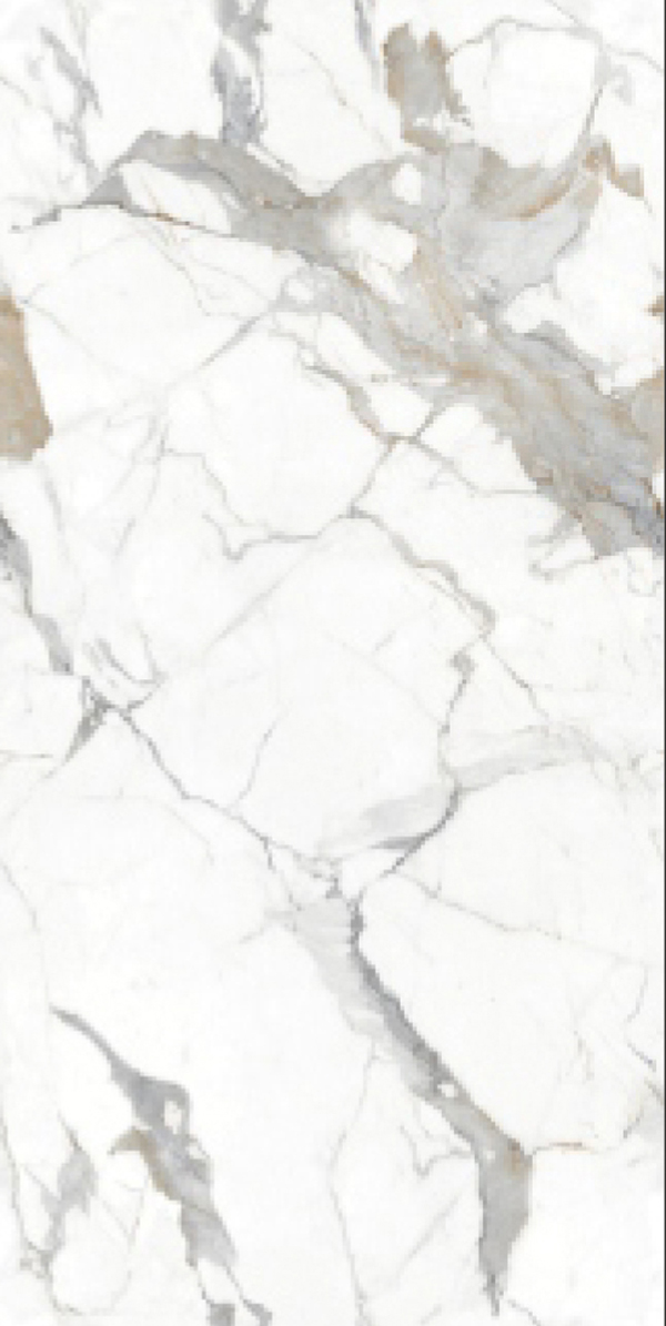
Marble-look surface designs are the most effective and most searched direction for bookmatch tiles because marble veining has the ideal properties for mirror composition. Marble veining is bold enough to create dramatic symmetrical patterns when mirrored, varies naturally across the tile face in a way that creates interesting compositions at the mirror joint, and is recognisable as a quality indicator from a distance. Marble look tiles in large-format bookmatched GVT or porcelain from Morbi include Carrara white and grey veining, Statuario with bold gold and grey veining, Calacatta with dramatic bold veining, and Nero Marquina black with white veining. Each veining character creates a different visual composition when bookmatched.
Bookmatched marble tiles in Indian residential and commercial design almost always refer to GVT or porcelain tiles with a marble-look surface design rather than actual cut marble. Actual bookmatched marble requires a single natural stone block to be cut in matched pairs: the cost of quarrying, cutting, and transporting matched natural marble slabs in 1200x2400mm size is significantly above the budget of all but the most premium Indian residential and commercial projects. GVT and porcelain bookmatched marble-look tiles from Morbi give the same visual effect at a fraction of the cost, with a non-porous tile body that has none of the acid sensitivity and maintenance demands of actual marble.
The visual difference between GVT bookmatched marble-look and actual bookmatched natural marble is most apparent at close range: a GVT tile has a consistent, digitally controlled surface pattern that repeats at the tile level; actual marble has unique variation within each slab. From the normal room viewing distance of 2 to 4 metres, GVT bookmatched marble-look is visually indistinguishable from actual bookmatched marble for most buyers and for most design applications.
Bookmatched Porcelain Slabs
Bookmatched porcelain slabs in 1200x1800mm and 1200x2400mm are the most premium tile product direction from Morbi and represent the highest available surface quality in Indian tile manufacturing. A bookmatched porcelain slab wall panel in a hotel lobby, premium bathroom, or luxury residential living room tiles feature wall gives the surface a quality that is comparable to a natural stone installation at a manufactured tile price point, with superior consistency and significantly lower maintenance.
The 2400x1200mm (8x4 feet) bookmatched porcelain slab is the largest standard slab format from Morbi and creates the widest single bookmatched composition available in the Indian tile market. Two 2400x1200mm slabs placed side by side create a bookmatched panel 4800mm wide: the full width of a standard Indian living room or hotel lobby feature wall covered in two slabs with a single bookmatching joint at the centre. This is the closest manufactured tile product to a natural stone bookmatched feature wall installation and gives the space a quality that no other tile product can replicate.
Porcelain slab installation for bookmatched panels requires a specialist contractor with experience in large-format slab handling. A single 1200x2400mm porcelain slab weighs 60 to 80 kg and requires suction cup lifting equipment, a team of at least two experienced tilers, and a perfectly flat, primed wall substrate. Price range: Rs. 90 to Rs. 185 per sq ft for bookmatched porcelain slabs in 1200x1800mm and above from Morbi.
Bookmatch Wall Tiles: Where the Effect Works Best
Bathroom Feature Wall
The bathroom tile feature wall is the most common and most effective location for bookmatched tiles in Indian residential design. A full-height bathroom feature wall behind the freestanding bathtub, behind the double basin vanity, or on the shower wall in a large bathroom is the ideal canvas for a bookmatched marble-look GVT or porcelain slab panel. The bathroom viewing distance (typically 1.5 to 2.5 metres from the feature wall to the bathroom entrance or opposite wall) is close enough that the bookmatched composition is seen at a scale where the mirror pattern is fully legible and reads as a dramatic design statement. Price range: Rs. 65 to Rs. 145 per sq ft for bookmatched large-format GVT bathroom feature wall tiles.
Hotel Lobby and Reception Wall
Hotel lobby feature walls in Indian mid-range to premium hotels are the most ambitious and most visually impactful application for bookmatched porcelain slabs. A reception wall in bookmatched 1200x2400mm Calacatta or Statuario porcelain in polished finish communicates luxury and quality to every arriving guest with a level of visual impact that no other tile product achieves at the same price point. The scale of a hotel lobby allows the full bookmatching composition to be read from the entrance, across the lobby floor, which is the viewing distance at which bookmatching creates its most dramatic impression.
Living Room Feature Wall
A bookmatched GVT or porcelain feature wall panel in a living room tiles context (the wall behind the television, the sofa-back wall, or the dining area focal point) gives the room the most premium surface quality available in a tile product. In a living room with a ceiling height of 2700mm to 3000mm, a 1200x1800mm bookmatched slab in Calacatta polished finish creates a full three-slab vertical panel with two bookmatching joints, giving the wall a dramatic symmetrical composition that reads as a completely designed surface from across the room.
Kitchen Full-Height Backsplash Panel
A bookmatched large-format GVT panel as a full-height kitchen backsplash tile from worktop to ceiling gives the kitchen a feature wall quality at the cooking zone. In a contemporary Indian modular kitchen where the backsplash runs to ceiling height (2400mm to 2700mm), a bookmatched 600x1200mm GVT in marble-look polished finish creates a tall vertical composition with one bookmatching joint at every tile pair. The effect is less dramatic than a slab-format bookmatched panel but significantly more design-forward than a standard subway or plain tile backsplash.
Bookmatch Floor Tiles
Bookmatching is less commonly used on floors than on walls for a specific visual reason: the mirror pattern in a bookmatched tile is designed to be seen from the front, at eye level, where the symmetrical composition reads as a complete visual form. On a floor, the tile is seen from above at a standing angle, which foreshortens the bookmatching pattern and makes the mirror composition less legible than it is on a vertical wall surface.
However, bookmatched large-format tiles on a floor are used in specific contexts where the floor is seen from above at a distance: hotel lobby floors viewed from a mezzanine or upper level, premium residential entrance foyers viewed from the landing of a staircase above, and spa and luxury bathroom floors where the occupant lies in a bathtub and views the floor as a horizontal composition. In these contexts, the bookmatching on the floor creates the same mirror composition that wall bookmatching creates on a vertical surface. For
standard residential floor applications, bookmatching is a design detail that adds quality but is not the primary visual element of the floor, the way it is on a feature wall. Foyer tiles in bookmatched large-format GVT in a polished finish give the entrance area a premium quality that reads from the main door.
Installation Precision for Bookmatched Tiles
Bookmatching requires a higher level of installation precision than any other tile application. The mirror effect at the joint between two bookmatched tiles only works when the tiles are aligned perfectly: a 1mm misalignment at the joint disrupts the continuity of the veining pattern across the joint and makes the bookmatching visible as a seam rather than a mirror. The precision demands increase with tile size: a 1mm alignment error is more visible across a 1200x2400mm slab joint than across a 600x1200mm tile joint because the misalignment is seen over a larger area.
Substrate preparation: The wall or floor substrate must be perfectly flat before bookmatched tile installation. Any hollow, bulge, or unevenness in the substrate creates a gap or tilt at the tile edge that misaligns the bookmatching joint. For slab sizes of 1200x1800mm and above, the substrate must be screeded or levelled to within 2mm over any 2-metre span before tiling.
Adhesive coverage: Full 100% adhesive coverage behind every bookmatched tile is mandatory. Any void behind the tile can cause a slight tilt or deflection that misaligns the bookmatching joint. Apply adhesive to both the wall and the tile back. Use a large-notched trowel on the wall and a medium-notched trowel on the tile back for large-format tiles.
Sequence and orientation: Install bookmatched tiles in a strict A-B sequence. Never place two A tiles adjacent to each other or two B tiles adjacent to each other: the bookmatching only works at A-B joints. Mark the tile faces with A and B before beginning installation. Open only the tiles for the section being installed to avoid mixing the sequence.
Tile cutting: When a bookmatched tile must be cut for the perimeter, the cut must maintain the correct edge of the tile for the bookmatching joint. Cutting from the non-joint edge preserves the mirror composition at the bookmatching joint. Cutting from the joint edge disrupts the mirror pattern. Plan the layout before installation to identify which tiles require cutting and which edges must be preserved.
Grout for Bookmatched Tiles
The grout joint specification for bookmatched tiles is the most important finishing decision in a bookmatch installation because the grout joint is where the mirror effect either succeeds or fails visually. A wide grout joint with a contrasting colour creates a visible line at the bookmatching joint that interrupts the continuity of the mirrored pattern. A narrow joint with a matching colour epoxy grout makes the joint nearly invisible and allows the book-matching pattern to read as a continuous mirrored surface.
Joint width: 1.5mm is the target for bookmatched slab installations. At 1.5mm with matching colour epoxy grout, the joint is nearly invisible from the normal room viewing distance, and the book-matching reads as a continuous mirror surface. At 3mm, the joint reads as a visible line that interrupts the mirror pattern. Achieving 1.5mm joints consistently across a large-format slab installation requires experience and precision tile spacers rated for large format.
Grout type: Epoxy grout in a colour matched to the tile background is the only grout specification that allows the joint to disappear visually. The non-porous surface of epoxy grout does not absorb the colour variation that stains cement grout joints over time, maintaining the colour match permanently. Cement grout, even in a matching colour, shows colour variation over time as it absorbs moisture and cleaning products, eventually reading as a visible line across the book-matching pattern.
Grout colour matching: For a white or light marble-look bookmatched tile, the grout colour should match the lightest tone of the tile background, not the average tone. A grout that is slightly lighter than the tile background disappears more effectively than a grout that exactly matches the average tile colour.
Bookmatch Tiles Pricing from Morbi
| Product | Format | Surface Design | Finish | Retail Price (Rs./sq.ft) |
|---|---|---|---|---|
| Bookmatched GVT large format | 600x1200mm | Marble-look (Carrara, Statuario) | Polished or Satin Matte | Rs. 65 to Rs. 120 |
| Bookmatched GVT large format | 800x1600mm | Marble-look, stone-look | Polished or Satin Matte | Rs. 80 to Rs. 145 |
| Bookmatched porcelain slab | 1200x1800mm | Marble-look (Calacatta, Statuario, Nero Marquina) | Polished or Honed | Rs. 90 to Rs. 165 |
| Bookmatched porcelain slab | 1200x2400mm | Marble-look premium | Polished or Honed | Rs. 100 to Rs. 185 |
| Bookmatched porcelain slab 8x4 | 2400x1200mm | Marble-look premium | Polished | Rs. 110 to Rs. 195 |
Installation note: Standard large format (600x1200mm to 800x1600mm) bookmatched tile installation: Rs. 55 to Rs. 85 per sq ft. Slab installation (1200x1800mm and above) requires a specialist contractor, suction lifting equipment, and precision levelling screed: Rs. 90 to Rs. 150 per sq ft installation. Total installed cost for a premium bookmatched slab feature wall: Rs. 190 to Rs. 345 per sq ft.
Choose the Right Bookmatch Tile
Bookmatch tile selection starts with the wall or floor surface where the effect will be seen, then the size of the tile or slab that creates a composition legible from the viewing distance of that space. Request A and B tile samples and place them side by side before ordering the full quantity to verify the book-matching composition on your specific tile. Browse bookmatched large-format GVT and porcelain slab tiles in marble-look and stone-look directions on TilesFinders. Confirm the installation contractor has experience with large-format slab fixing and precision joint alignment before committing to a bookmatched slab installation.


FAQs
A bookmatch tile is a tile produced in paired A and B variants where the surface design on tile B is a digital mirror image of tile A. When tiles are placed in an A-B sequence on a wall or floor, the surface design mirrors across every A-B joint to create a symmetrical, continuous pattern. The name comes from the stone industry technique of opening two adjacent stone slabs like the pages of a book, where the grain pattern on the left page mirrors the right. In GVT and porcelain from Morbi, bookmatching is achieved through digital surface design paired with matched production sequencing.
Slab sizes of 1200x1800mm and above give the most dramatic bookmatching effect because the mirror composition is wide enough to read as a completely designed surface from a normal room viewing distance. 1200x2400mm is the most used premium bookmatched slab size for hotel lobbies and bathroom feature walls in Indian premium residential design. 600x1200mm bookmatched large-format tiles give a noticeable but less dramatic effect, suitable for compact bathroom feature walls and kitchen full-height backsplash panels.
Bookmatched marble tiles in the GVT and porcelain tile range are marble-look surface designs on a manufactured tile body, not actual cut natural marble. Actual bookmatched natural marble requires matched pairs from the same stone block, which is a premium natural stone product at a significantly higher cost than manufactured tile. GVT and porcelain bookmatched marble-look tiles from Morbi give the same visual effect with a non-porous, acid-resistant tile body that has none of the maintenance requirements of actual marble. From normal room viewing distance, the GVT bookmatched marble-look is visually comparable to actual bookmatched marble.
An 8x4 bookmatch tile refers to a porcelain slab in 8 feet by 4 feet format, which equals 2400mm by 1200mm. This is the largest standard slab size produced in Morbi and creates a book-matching mirror composition 2400mm wide at each slab joint. Two 2400x1200mm slabs placed side by side create a 4800mm wide bookmatched panel, covering the full width of a standard Indian living room or hotel lobby feature wall with a single central bookmatching joint. Price range: Rs. 110 to Rs. 195 per sq ft for 2400x1200mm bookmatched porcelain slabs from Morbi.
Epoxy grout in a colour matched to the lightest tone of the tile background, at 1.5mm joint width, is the correct specification for bookmatched tiles. At 1.5mm with matching colour epoxy grout, the joint is nearly invisible from room viewing distance, and the book-matching pattern reads as a continuous mirror surface. Cement grout, even in a matching colour, shows colour variation over time and eventually reads as a visible line that interrupts the mirror pattern. Epoxy grout maintains its colour permanently, keeping the book-matching joint invisible indefinitely.
Yes, but with the understanding that the bookmatching mirror effect reads differently on a floor than on a wall. On a vertical wall, the mirror pattern is seen from the front and reads as a complete symmetrical composition. On a horizontal floor, the pattern is seen from above at a foreshortened angle, which reduces the legibility of the mirror composition. Bookmatched floor tiles work most effectively in spaces where the floor is seen from above at a distance: hotel lobby mezzanines, staircase landings, and luxury bathroom floors viewed from a bathtub. In standard residential floor applications, bookmatching adds quality but is not the primary visual element.
Bookmatched tile installation requires significantly more precision than standard tile installation. The key requirements: a perfectly flat substrate (within 2mm over 2 metres for slab sizes), 100% adhesive coverage behind every tile, strict A-B tile sequence maintained throughout the installation, 1.5mm joint width achieved consistently with precision spacers, and careful attention to which edges are cut to preserve the bookmatching joint. Slab sizes of 1200x1800mm and above additionally require suction cup lifting equipment and a team of at least two experienced tilers. Bookmatching should not be specified with an installer who has not previously completed a similar installation.