Monochrome Tiles in India: Bold Single-Colour Design Guide for Modern Homes
Master monochrome tile design in Indian homes. Learn how to layer tonal shades and textures in charcoal, navy, and terracotta without making your space look flat.
- What Monochrome Actually Means in Tile Design
- Best Monochrome Colour Families for Indian Homes
- Building a Monochrome Palette: Room by Room
- Where Monochrome Succeeds and Where It Struggles
- Common Mistakes in Monochrome Tile Design
- Monochrome GVT in India: 2026 Manufacturing Context
- Browse Monochrome Tile Palettes on TilesFinders
Monochrome isn't one flat color, it requires layering 3 tonal shades (light, mid, dark) and mixing finishes (matte + gloss) within a single hue family. Always match your grout tone to keep the look seamless.
Monochrome tile design commits to a single hue and builds an entire room, or an entire home, from its lightest to darkest tones, rather than mixing separate colours across floor, wall, and accent. Done well, this reads as confident and architectural. Done without the tonal discipline it requires, it reads as flat and unfinished. This guide explains how to actually build a monochrome palette in tile, which colours work best for Indian light and lifestyle conditions, and where a single-colour scheme succeeds or fails by room.
What Monochrome Actually Means in Tile Design
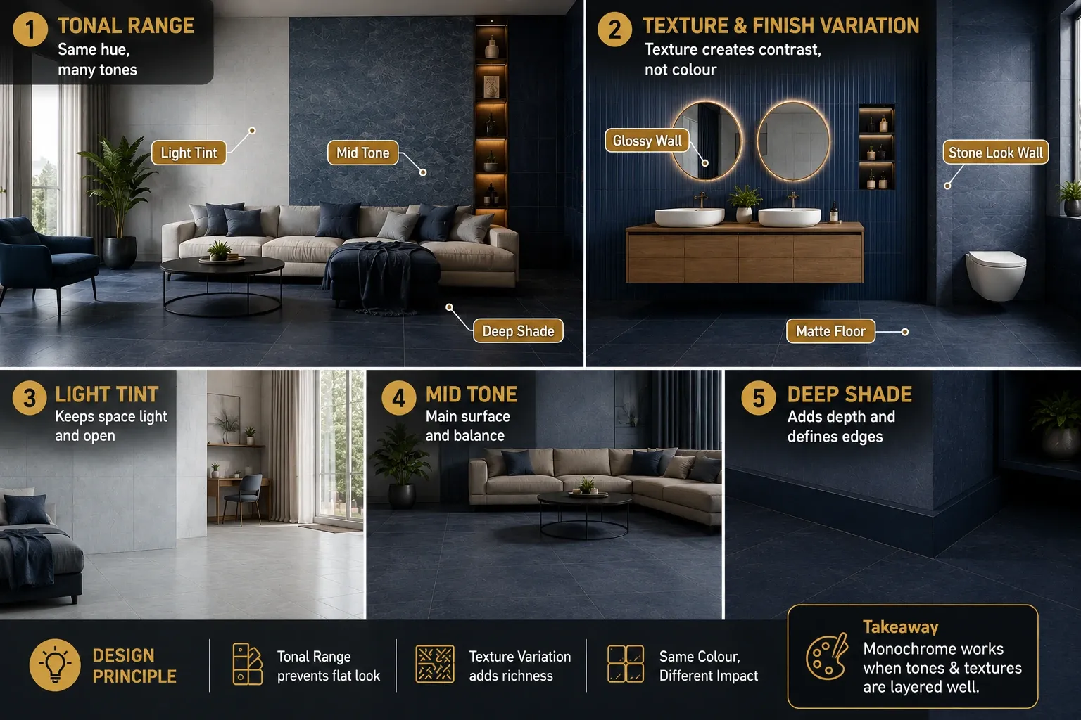
Monochrome does not mean using one single flat colour everywhere. It means selecting one hue family, navy, forest green, terracotta, charcoal, and deploying it across a tonal range, from its palest tint to its deepest shade, so the room reads as cohesive rather than uniform. The tonal variation is what prevents monochrome tiles from feeling flat.
| Tonal Role | What It Does | Typical Tile Application |
| Lightest tint | Provides the base and largest surface area, keeps the room from feeling heavy | Walls, ceiling-adjacent surfaces, largest floor zones in a light-forward scheme |
| Mid tone | Bridges light and dark, often the most-used tone across the largest tiled surface | Primary floor tile, main wall tile in a mid-forward scheme |
| Deepest shade | Anchors the room and defines edges, borders, and focal points | Skirting, borders, feature walls, accent strips |
| Texture and finish variation | Substitutes for colour contrast, since colour itself stays within one family | Matte floor against sugar finish or gloss wall in the same hue, or a stone-look print against a plain colour |
Design principle: A monochrome scheme succeeds or fails on tonal range and texture variation, not on colour choice alone. Two rooms in the exact same shade of navy can read completely differently: one flat and lifeless because every surface is the identical tone and finish, the other rich and architectural because the floor is a deep matte navy, the walls a mid-tone navy stone-look, and a single feature strip in the palest navy tint. The colour is the same; the tonal engineering is what makes the difference.
From The Marketplace
Popular tiles right now









Best Monochrome Colour Families for Indian Homes
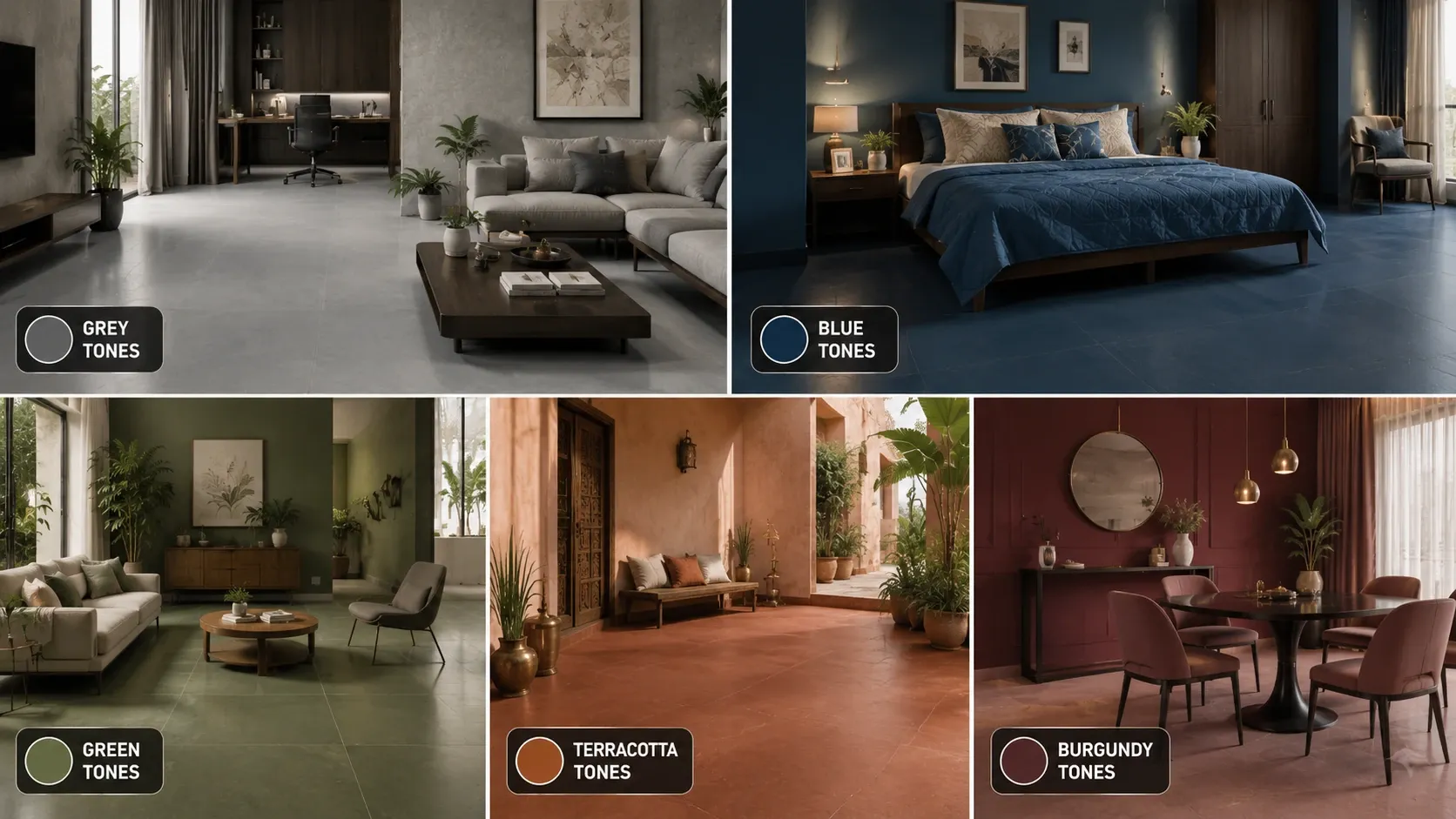
| Colour Family | Character | Best Room | Indian Light Performance |
| Charcoal to light grey | Architectural, contemporary, the most versatile monochrome family | Living rooms, home offices, formal spaces | Stable across all Indian light conditions, the safest monochrome starting point |
| Deep navy to pale blue-grey | Formal, calming, culturally resonant with Indian textile traditions | Bedrooms, formal dining rooms, bathrooms | Reads richest under warm-white light, can feel cool under strong daylight without warm accents |
| Forest green to sage | Botanical, grounding, increasingly popular for 2026 Indian interiors | Living rooms, bedrooms, home office | Performs well across most conditions, gains warmth under 2700K lighting |
| Terracotta to pale ochre | Warm, earthy, culturally rooted in Indian material tradition | Living rooms, courtyards, puja rooms | Most vivid under direct sunlight, can flatten under cool artificial light |
| Deep burgundy to blush | Confident, warm, less commonly attempted but increasingly seen in premium 2026 projects | Formal dining rooms, statement powder rooms | Reads richest under warm-white light, requires confident lighting planning |
Building a Monochrome Palette: Room by Room
Idea 1: Charcoal Monochrome Living Room
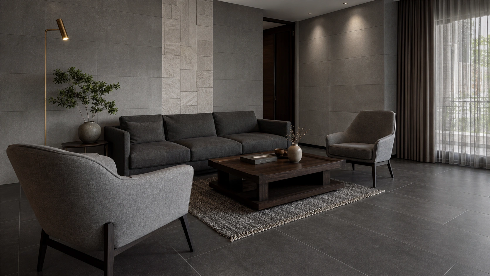
Charcoal, mid-grey, and pale grey GVT | 2x4 (600x1200 mm) floor, mixed sizes elsewhere | Matte and sugar finish mix | Rs. 90 to Rs. 160/sq.ft
Deep charcoal matte floor tiles, mid-grey sugar-finish wall tiles, and a pale grey stone-look feature strip build a full tonal range within a single hue family, the safest and most versatile monochrome entry point for an Indian living room.
Idea 2: Deep Navy Monochrome Bedroom
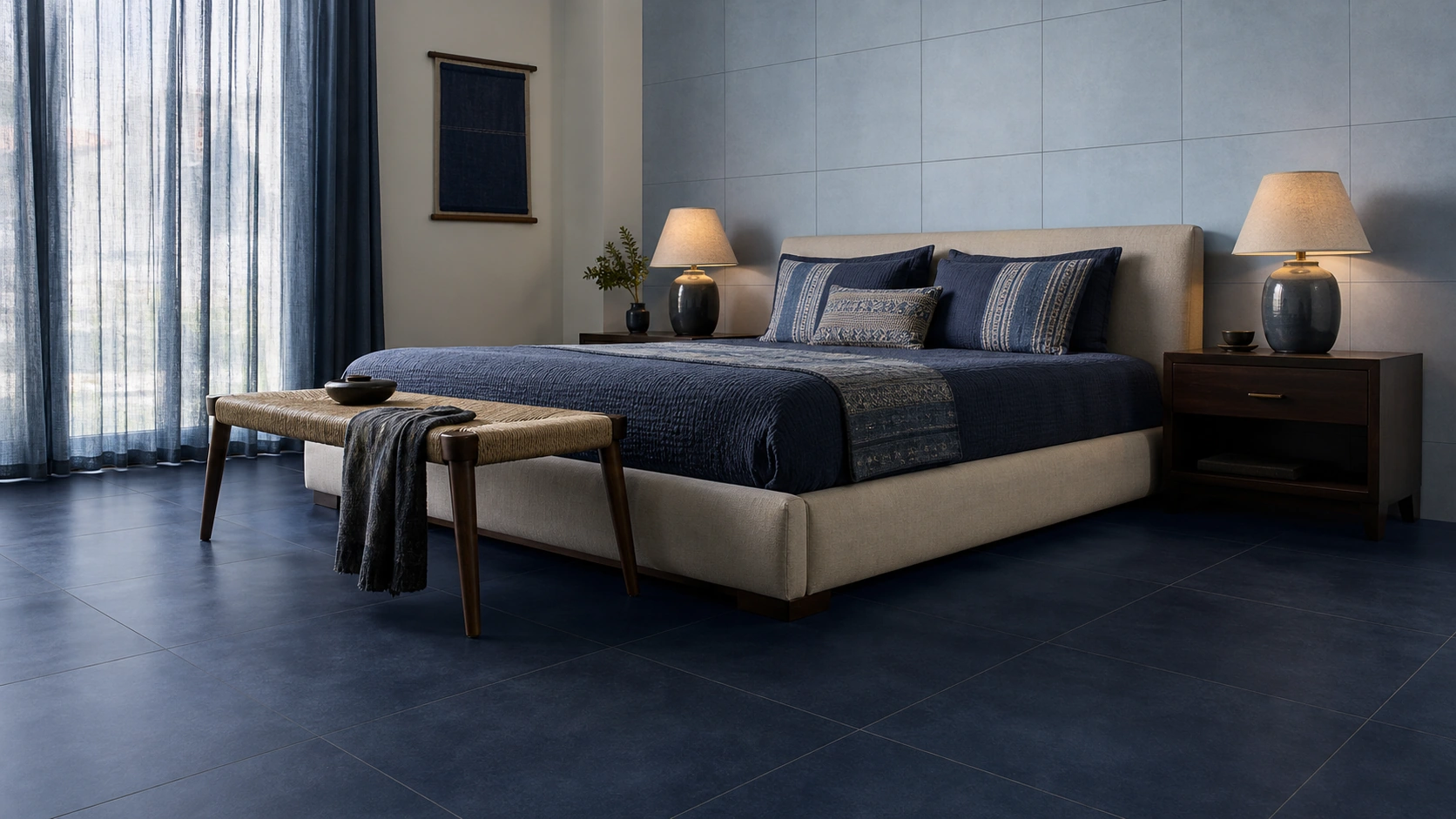
Navy, blue-grey, and pale blue GVT | 2x2 or 24x24 (600x600 mm) | Matte and satin matte mix | Rs. 85 to Rs. 150/sq.ft
A navy matte floor tiles paired with a pale blue-grey satin matte headboard wall creates a formal, restful monochrome bedroom, the tonal shift and finish change between floor and wall preventing the room from reading as a single flat block of colour.
Idea 3: Forest Green Monochrome Living Room
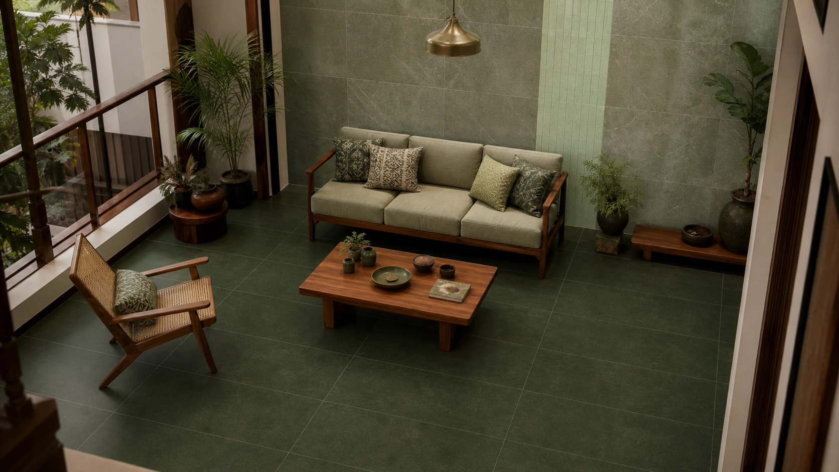
Forest green, sage, and pale mint GVT | 2x4 (600x1200 mm) floor | Matte and stone-look texture mix | Rs. 90 to Rs. 145/sq.ft
A deep forest green floor with sage stone-look walls and a pale mint accent strip builds a botanical monochrome scheme well suited to Indian homes in 2026, gaining warmth and depth under standard warm-white residential lighting.
Idea 4: Terracotta Monochrome Courtyard to Living Room
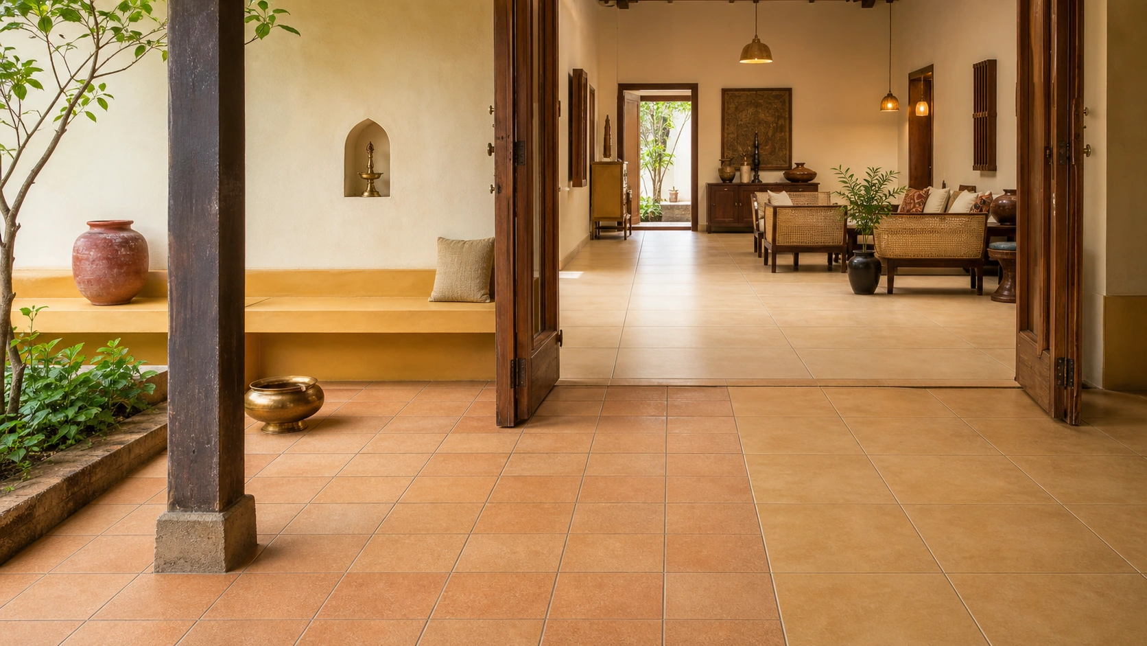
Terracotta, warm ochre, and pale sand GVT | 16x16 to 2x2 (400x400 to 600x600 mm) | Matte and textured matte mix | Rs. 70 to Rs. 130/sq.ft
Running a terracotta tonal range from a covered courtyard through to an adjoining living room creates visual continuity between indoor and outdoor zones; the warm hue family reads as culturally rooted rather than imported.
Idea 5: Charcoal and White Monochrome Bathroom
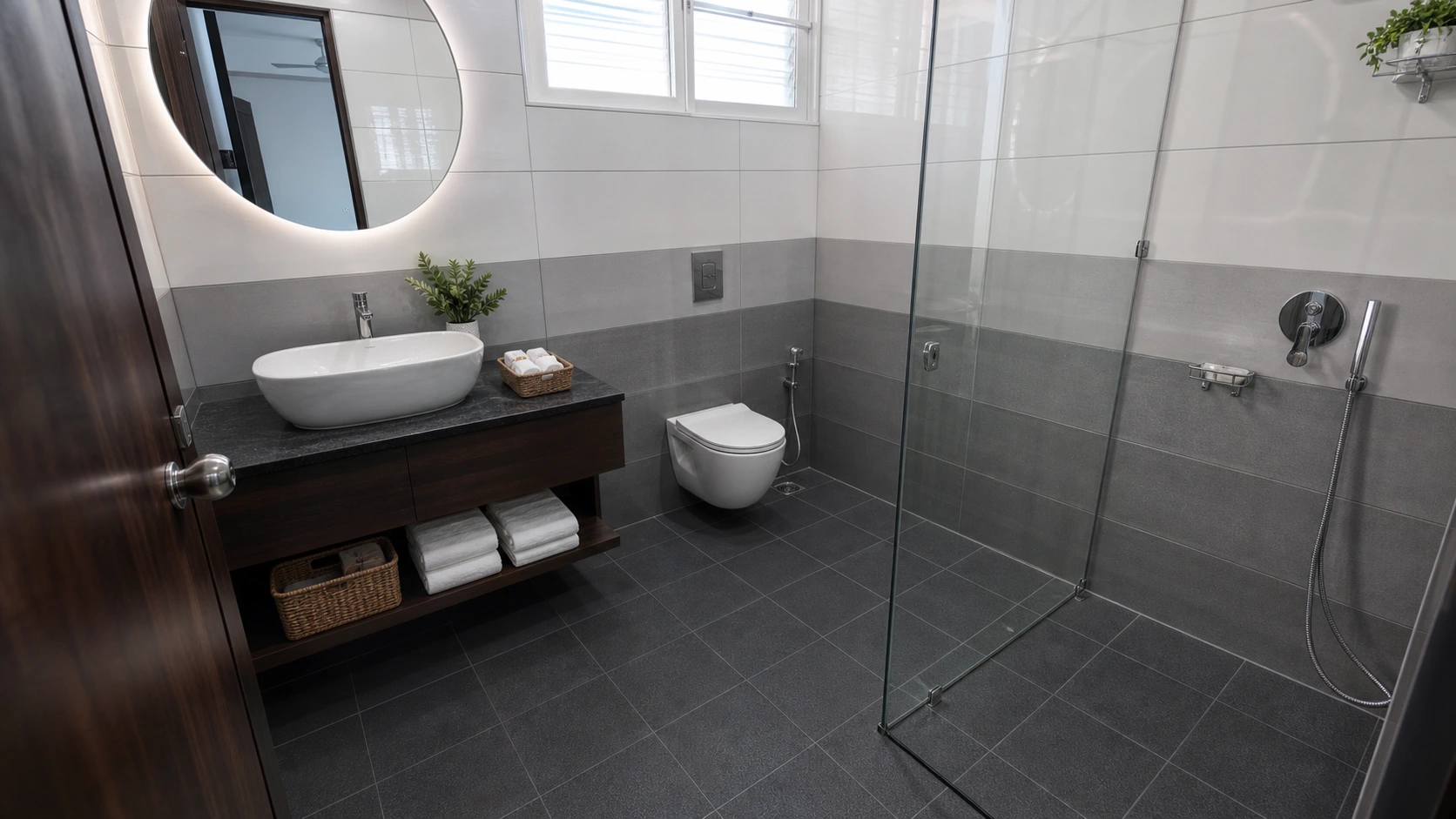
Charcoal, mid-grey, and white anti-skid and glossy GVT | 1x1 or 12x12 (300x300 mm) floor, 1x2 (300x600 mm) wall | Anti-skid matte floor, glossy wall | Rs. 75 to Rs. 140/sq.ft
A charcoal anti-skid floor with mid-grey and white glossy walls builds a monochrome bathroom where the tonal shift moves from dark underfoot to light at eye level, a deliberate weighting that keeps the compact room from feeling enclosed.
Where Monochrome Succeeds and Where It Struggles
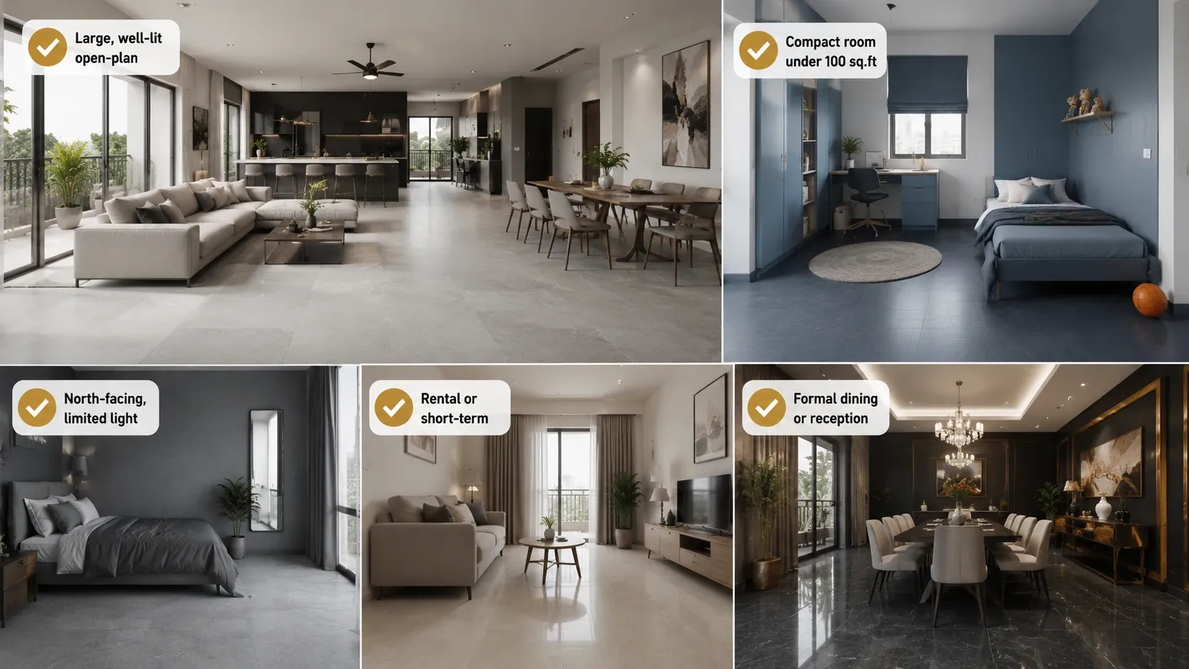
| Scenario | Monochrome Suitability | Why |
| Large, well-lit open-plan space | Excellent | Ample natural light and floor area let the full tonal range register clearly without feeling enclosed |
| Compact room under 100 sq.ft | Requires care | A dark, saturated single-hue scheme can read as enclosing in a small room; lean toward the paler end of the tonal range as the dominant surface |
| North-facing room with limited natural light | Requires care | Cooler hue families like navy and charcoal can read as cold without confirmed warm-white lighting throughout |
| Rental or short-term home | Not recommended for the boldest tones | A committed monochrome scheme in a strong hue is expensive to reverse; a more neutral base with monochrome accents is the flexible alternative |
| Formal dining or reception room | Excellent | The confident, singular colour statement suits a room with a clear formal purpose and controlled lighting plan |
Common Mistakes in Monochrome Tile Design
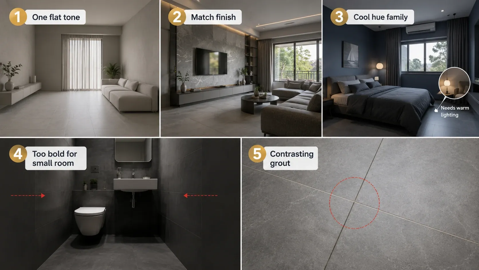
- Using one flat tone across every surface. Without a genuine tonal range from light to dark, the room reads as unfinished rather than confident. Build at least three distinct tones within the hue family.
- Matching finish as well as colour across every surface. All-matte or all-gloss in the same colour compounds the flat effect. Vary finish, matte floor against sugar finish or textured wall, to create depth without introducing a second colour.
- Choosing a cool hue family without confirming the lighting plan. Navy, charcoal, and grey-forward schemes need warm-white lighting at 2700K to avoid reading as cold, particularly in rooms with limited natural daylight.
- Applying a bold monochrome scheme to a very compact room. Deep, saturated tones can make a small room feel smaller. Lean toward the paler end of the tonal range as the dominant surface in any room under 100 sq.ft.
- Forgetting the grout. Grout colour should stay within the same tonal family as the surrounding tile in a monochrome scheme; a contrasting grout breaks the deliberate tonal cohesion the whole design depends on.
Monochrome GVT in India: 2026 Manufacturing Context
Manufacturers in Morbi, Gujarat, produce the full tonal range required for monochrome schemes, plain and stone-look GVT across light, mid, and dark values within charcoal, navy, forest green, and terracotta hue families, typically available across 1x1 or 12x12 (300x300 mm) through 2x4 (600x1200 mm) formats. Confirm tonal consistency across the different tiles in a single monochrome order, since light, mid, and dark tones are frequently sourced as separate SKUs that may come from different production batches even within the same manufacturer's range.
Browse Monochrome Tile Palettes on TilesFinders
Charcoal, navy, forest green, and terracotta tonal ranges across matte, sugar finish, and stone-look GVT are available on TilesFinders. Request samples of the full tonal range together before ordering to confirm the palette reads correctly as a cohesive scheme rather than as mismatched individual tiles.
FAQs
Monochrome means building a room from a single hue family across a tonal range, from its palest tint to its deepest shade, rather than mixing separate colours. It does not mean using one flat, identical colour on every surface; tonal variation and finish variation are what make a monochrome scheme read as intentional rather than flat.
Charcoal to light grey is the most versatile and forgiving monochrome family, performing consistently across all Indian light conditions and pairing with any furniture tone, making it the recommended starting point for a first monochrome project.
Yes, with care. Lean toward the paler end of the tonal range as the dominant surface in any room under 100 sq.ft, since a dark, saturated monochrome scheme can make a compact space feel smaller and more enclosed.
The same anti-skid rules apply as any bathroom: floors require confirmed anti-skid matte with COF 0.4 wet minimum regardless of the colour scheme, while walls can use any finish within the monochrome palette including glossy tones, since walls carry no slip risk.
A minimum of three: a light tone, a mid tone, and a dark tone within the same hue family, distributed across floor, wall, and accent surfaces. Fewer than three tones tends to read as flat rather than deliberately monochrome.
Warm-white LED at 2700K is recommended for any cool-leaning monochrome hue family such as navy or charcoal, particularly in rooms with limited natural daylight, to prevent the scheme from reading as cold.
Match. Grout colour should stay within the same tonal family as the surrounding tile. A contrasting grout, particularly white, breaks the tonal cohesion that a monochrome scheme is specifically built to achieve.
Not inherently. Pricing depends on the specific tile designs chosen within the palette rather than on the monochrome concept itself. The main additional consideration is confirming tonal consistency across separately sourced SKUs for the light, mid, and dark tones, which may require closer batch coordination than a mixed scheme drawing from different colour families entirely.


See our tile guides first
Set TilesFinders as a preferred source and our buying guides surface ahead of the rest for you.
Add as preferred sourceTakes one tap. Nothing to install.
What Readers Say
I was about to redo my parking area with the wrong tile size until I read this. The layout comparisons saved me from a costly mistake.
We reference TilesFinders guides while briefing clients on material selection. The size and pattern breakdowns are accurate and easy to explain visually.
On site, I get asked about grout spacing all the time. This article gave me a solid reference I now share with my team before every job.
Finally a guide that doesn't just push generic advice. The oil stain removal steps actually worked on our clubhouse driveway tiles.
I run a small construction firm and now send this link to clients directly when they ask about entrance tile sizing. Saves me an hour of explaining.
Good practical detail, though I wish there were more examples for compact apartment entrances specifically, not just villas.
My mother-in-law wanted marble, I wanted vitrified. This blog gave us the neutral comparison we needed to actually decide together.
Detailed without being overwhelming. I appreciated that it covered both cost and maintenance, not just the aesthetics.
Used the algae and hard water removal tips on our terrace tiles after the monsoon. Worked better than what our regular cleaner was doing.
As someone who sources tiles for multiple builder projects, I find these comparisons genuinely useful for vendor conversations, not just consumer content.
Recommended this to a client who kept second-guessing the entrance design. The small vs large layout section settled the debate instantly.
Straightforward and honest, no unnecessary jargon. Would like to see a similar breakdown for outdoor pool-deck tiles next.
We've bookmarked several TilesFinders guides for our design handbook. Reliable source when clients want data, not just opinions.
Two paths, one marketplace.
Get free quotes from verified suppliers.
Share your room, budget, and style. Suppliers in Morbi respond within hours.
Get Free QuotesList your business, reach real buyers.
Put your showroom in front of homeowners searching for tiles right now.
List Your BusinessMore Blogs
See all
Ceramic vs Porcelain vs Vitrified vs Natural Stone Tiles: The Complete Comparison
Stop confusing international specs with Indian reality! Learn why porcelain sits below vit...
Read More-221b7c9a-667f-42d2-b5b3-66ba2d2266c1.webp)
What Tile Finish Is Safest for Children's Rooms: Slip Ratings, Edges, and Maintenance Explained
Learn how to choose the safest tile finish for children's rooms by comparing slip ratings, edge p...
Read More
Commercial Tiles in India: Durability Standards, Designs and Procurement Guide
Choose the right commercial floor tiles with confidence. Compare PEI ratings, slip resistance, ti...
Read More