Dark Kitchen Floor Tiles vs Light Tiles – Pros & Cons
Dark or light kitchen floor tiles? Light tiles maximise space, while dark tiles add modern luxury. Weigh the pros, cons, and maintenance tips to find your perfect match.
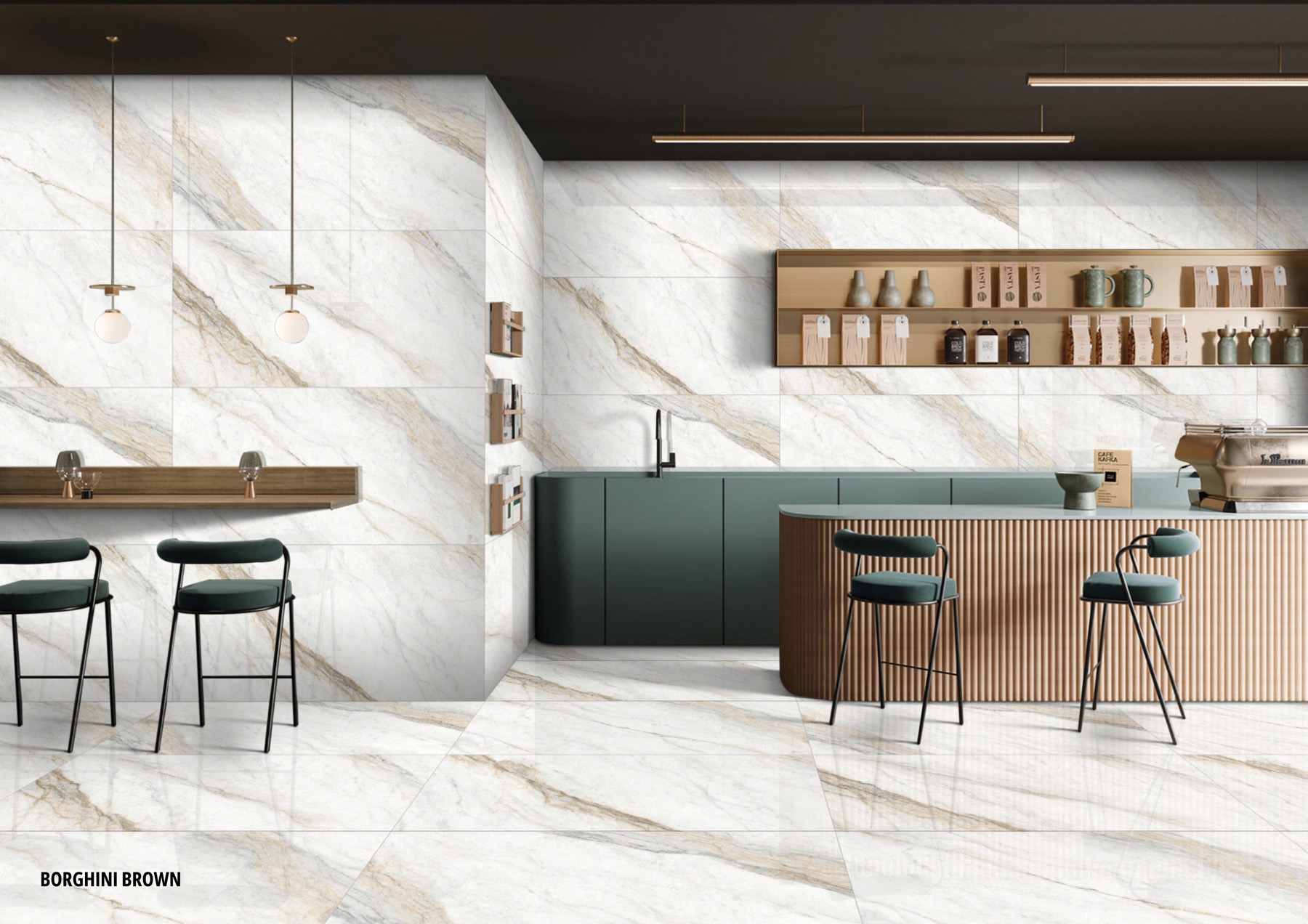
Choosing between dark and light tiles depends on your kitchen size and maintenance habits. Light tiles make small kitchens feel open but highlight dark stains, while dark kitchen floor tiles add depth and hide spills, but can make compact spaces feel heavier and show dust easily.
Light Kitchen Floor Tiles: The ultimate space maximiser
Light tiles are best for small or compact kitchens because they reflect light and make the space feel bigger. This is why light kitchen floor tiles are commonly used in apartments and galley layouts.
The Pros
- Makes small kitchens appear more spacious and open
- Creates a clean, bright, and timeless kitchen floor tile design
- Hides light dust and fine particles effectively
The Cons
- Shows dark spills, stains, and muddy footprints instantly
- Can feel too plain or sterile without contrast from cabinets or décor
Light tones like beige, ivory, and white work best when paired with warm materials such as wood or textured finishes to avoid a flat look.
Dark Kitchen Floor Tiles: The modern luxury statement
Dark tiles create a bold and premium look, especially in larger kitchens. Dark kitchen floor tiles act as a visual base that anchors the entire design and makes lighter elements stand out.
The Pros
- Hides dark stains like coffee, oil, and sauce spills
- Creates a rich, modern, and high-end appearance
- Makes large kitchens feel more balanced and less empty
The Cons
- Absorbs light, which can make small kitchens feel closed
- Shows light dust, flour, and crumbs very clearly
Shades like black, deep grey, or even emerald green are often used in modern kitchens where lighting is well planned.
Maintenance Reality Check: Which colour is actually easier to clean?
Neither dark nor light tiles are completely maintenance-free; it depends on what kind of mess your kitchen usually has.
Dark floors hide stains but highlight dust and dry particles like flour or salt. Light floors do the opposite; they hide dust but make stains more visible.
The most practical approach is the mid-tone rule. Instead of choosing pure white or pure black, go for shades like grey, greige, or terracotta. These tones balance visibility and reduce daily cleaning stress.
For example, a slightly textured 600x600 kitchen floor tile layout in mid-tones can naturally mask both stains and dust without looking too busy.
The Contrast Rule: How to match your floor colour with your kitchen cabinets
Floor colour should always complement your cabinets, not compete with them. A well-balanced floor tile design uses contrast to create visual clarity.
If using dark floors
Pair them with light cabinets such as white, beige, or soft grey. This creates a strong contrast that feels clean and structured.
If using light floors
Use darker cabinets like navy, forest green, or walnut. This prevents the kitchen from looking washed out and adds depth to the space.
Getting this balance right ensures the kitchen feels intentional rather than flat or overly heavy.
Size & Finish: Why large matte formats are mandatory for dark floors
Dark colours work best when paired with the right tile size and finish. Without this, the space can feel cluttered or difficult to maintain.
The Size Strategy
Larger tiles reduce grout lines, which helps the floor look more continuous. In modern kitchens, many homeowners prefer large-format kitchen floor tiles in an 800x1600 design because they create a cleaner, more seamless surface. Even other larger tile sizes can significantly improve the overall look by reducing visual breaks.
The Finish Strategy
Glossy dark tiles may look attractive initially, but are difficult to maintain. They show every footprint, watermark, and smudge.
Matte or slightly textured finishes are a better choice. They:
- Hide marks and stains more effectively
- Provide a better grip in wet areas
- Maintain a consistent appearance over time
This combination of size and finish ensures that dark tiles look premium without becoming high-maintenance.
FAQs
Avoid pure white grout, as it tends to discolour over time. A light grey or silver epoxy grout is more practical and maintains a cleaner look.
Yes, especially in low-light kitchens. This effect can be balanced by using proper lighting and lighter-coloured cabinets to maintain openness.
Medium- to dark-wood-look tiles are usually more practical. They hide dirt better while still adding warmth and texture to the space.

See our tile guides first
Set TilesFinders as a preferred source and our buying guides surface ahead of the rest for you.
Add as preferred sourceTakes one tap. Nothing to install.
What Readers Say
I was about to redo my parking area with the wrong tile size until I read this. The layout comparisons saved me from a costly mistake.
We reference TilesFinders guides while briefing clients on material selection. The size and pattern breakdowns are accurate and easy to explain visually.
On site, I get asked about grout spacing all the time. This article gave me a solid reference I now share with my team before every job.
Finally a guide that doesn't just push generic advice. The oil stain removal steps actually worked on our clubhouse driveway tiles.
I run a small construction firm and now send this link to clients directly when they ask about entrance tile sizing. Saves me an hour of explaining.
Good practical detail, though I wish there were more examples for compact apartment entrances specifically, not just villas.
My mother-in-law wanted marble, I wanted vitrified. This blog gave us the neutral comparison we needed to actually decide together.
Detailed without being overwhelming. I appreciated that it covered both cost and maintenance, not just the aesthetics.
Used the algae and hard water removal tips on our terrace tiles after the monsoon. Worked better than what our regular cleaner was doing.
As someone who sources tiles for multiple builder projects, I find these comparisons genuinely useful for vendor conversations, not just consumer content.
Recommended this to a client who kept second-guessing the entrance design. The small vs large layout section settled the debate instantly.
Straightforward and honest, no unnecessary jargon. Would like to see a similar breakdown for outdoor pool-deck tiles next.
We've bookmarked several TilesFinders guides for our design handbook. Reliable source when clients want data, not just opinions.
Two paths, one marketplace.
Get free quotes from verified suppliers.
Share your room, budget, and style. Suppliers in Morbi respond within hours.
Get Free QuotesList your business, reach real buyers.
Put your showroom in front of homeowners searching for tiles right now.
List Your Business