800x1600 Tiles for Living Room Floor: Indian Designer Picks 2026
June 13, 2026 5
Discover the best 800x1600 mm living room tiles for Indian homes in 2026, including designer-recommended finishes, colours, layouts, and GVT vs PGVT guidance.
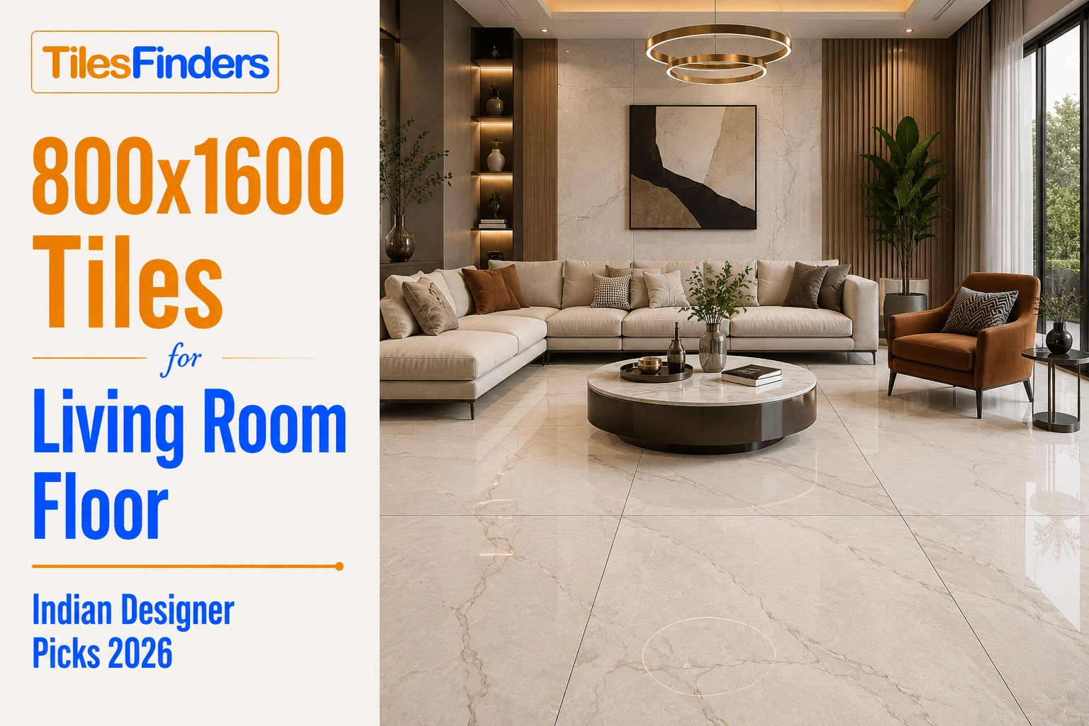
800x1600 mm tiles have become a preferred large-format choice for premium Indian living rooms due to their seamless appearance and luxurious feel. Designer favourites for 2026 include Statuario White, Calacatta Gold, Arctic Grey, Travertine, and Bianco Carrara. For daily-use family spaces, GVT Posh or GHR finishes offer lower maintenance, while PGVT polished tiles deliver maximum visual impact in formal living rooms.
800x1600 mm tiles have become the default large-format choice for living room floors in premium Indian homes. The format is now common enough in 2BHK and 3BHK renovations across Mumbai, Bengaluru, Pune, and Hyderabad that Indian designers have moved past the question of whether to use it and are focused on how to use it well.
The how matters more than most buyers realise. The same 800x1600 mm tile in Statuario white can look genuinely luxurious in one living room and slightly cold and clinical in another, depending on the layout direction, grout colour, lighting temperature, and what it is paired with on the walls and in the furniture.
This guide covers the design picks that Indian architects and interior designers are recommending for living room floors in 2026, what makes each pick work in Indian home conditions, and the practical decisions around layout direction, finish, grout, and room size that determine whether 800x1600 achieves the result you are paying for.
Why Indian Designers Are Choosing 800x1600 for Living Rooms in 2026
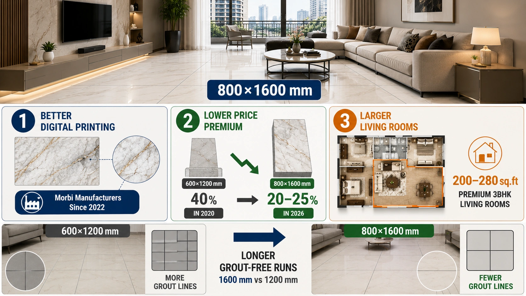
Three things are driving the shift to 800x1600 mm in Indian living rooms. First, the improvement in digital printing quality from Morbi manufacturers since 2022 means today's marble-look GVT and PGVT in this format are genuinely convincing at normal viewing distances. Second, the wider availability of this size from more manufacturers has brought the price premium over 600x1200 mm (2x4) down from 35 to 40 per cent in 2020 to closer to 20 to 25 per cent in 2026 for equivalent quality. Third, Indian apartment living rooms are getting larger in new premium projects, with halls in 3BHK apartments now regularly running 200 to 280 sq. ft.
At 200 sq. ft. and above, the visual difference between 800x1600 mm and 600x1200 mm is real and obvious once furniture is in place. The longer grout-free runs at 1600 mm versus 1200 mm give the floor a quieter, more continuous surface that reads as genuinely slab-like from across the room. This is the effect Indian designers and their clients are paying for.
For a full picture of how 800x1600 compares to 600x1200 on total installed cost and which rooms justify the premium, the comparison of 800x1600 versus 2x4 tiles (600x1200 mm) for Indian homes covers the decision in detail. This guide focuses specifically on how to make 800x1600 look its best once you have decided to use it in your living room.
Room Size and Layout Direction: Getting the Basics Right First
Before any design decision, the two practical questions are: is the room large enough, and which direction should the tiles run?
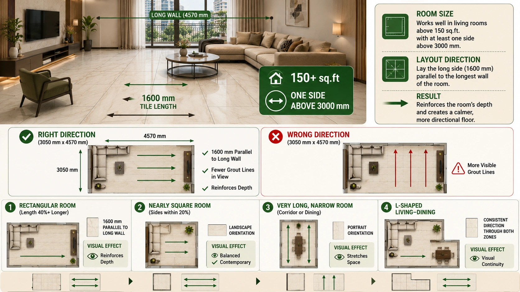
For room size, 800x1600 mm tiles work well in living rooms above 150 sq. ft. with at least one dimension above 3000 mm. Below 150 sq. ft., the cutting waste and the visual proportion of the tile to the room size both work against you. The full room-by-room size analysis with wastage calculations is in the 800x1600 tile layout guide for Indian room sizes, which should be your first stop before ordering.
For layout direction, the standard recommendation from Indian designers is to lay the long side of the tile (1600 mm) parallel to the longest wall of the room. This reinforces the room's depth and makes it read as longer. In a 3050 mm x 4570 mm living room, running the 1600 mm length along the 4570 mm wall means fewer tiles in the primary viewing direction and grout lines that align with the room's main axis. The result is a calmer, more directional floor.
In square-ish rooms (where the dimensions are close to equal), landscape orientation (1600 mm horizontal) is the standard choice. Portrait orientation (1600 mm vertical, pointing away from the viewer toward the far wall) is used in narrow rectangular rooms like corridors and long dining areas to create the illusion of greater length. In a square or near-square Indian living room, portrait orientation can make the room feel oddly elongated in one direction.
| Room Shape | Recommended Tile Orientation | Visual Effect |
| Rectangular (length 40%+ longer) | 1600 mm parallel to the long wall | Reinforces depth, calm directional floor |
| Nearly square (sides within 20%) | Landscape (1600 mm horizontal) | Balanced, wide, contemporary |
| Very long, narrow (corridor or dining) | Portrait (1600 mm pointing away) | Stretches space visually |
| L-shaped living-dining | Consistent direction through both zones | Visual continuity across zones |
Top Design Picks Indian Designers Are Recommending in 2026
1. Statuario White PGVT: The Clean Luxury Standard
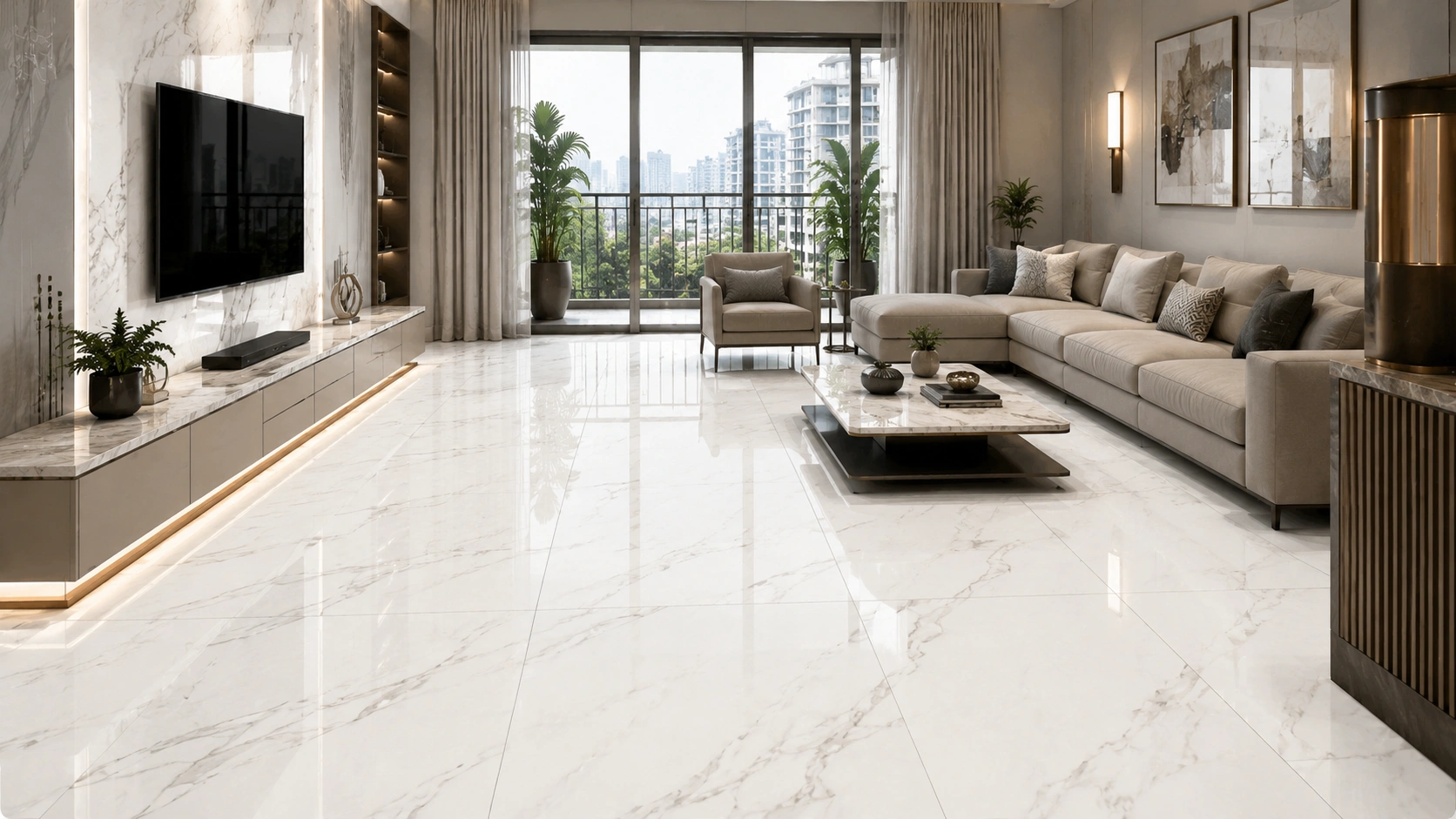
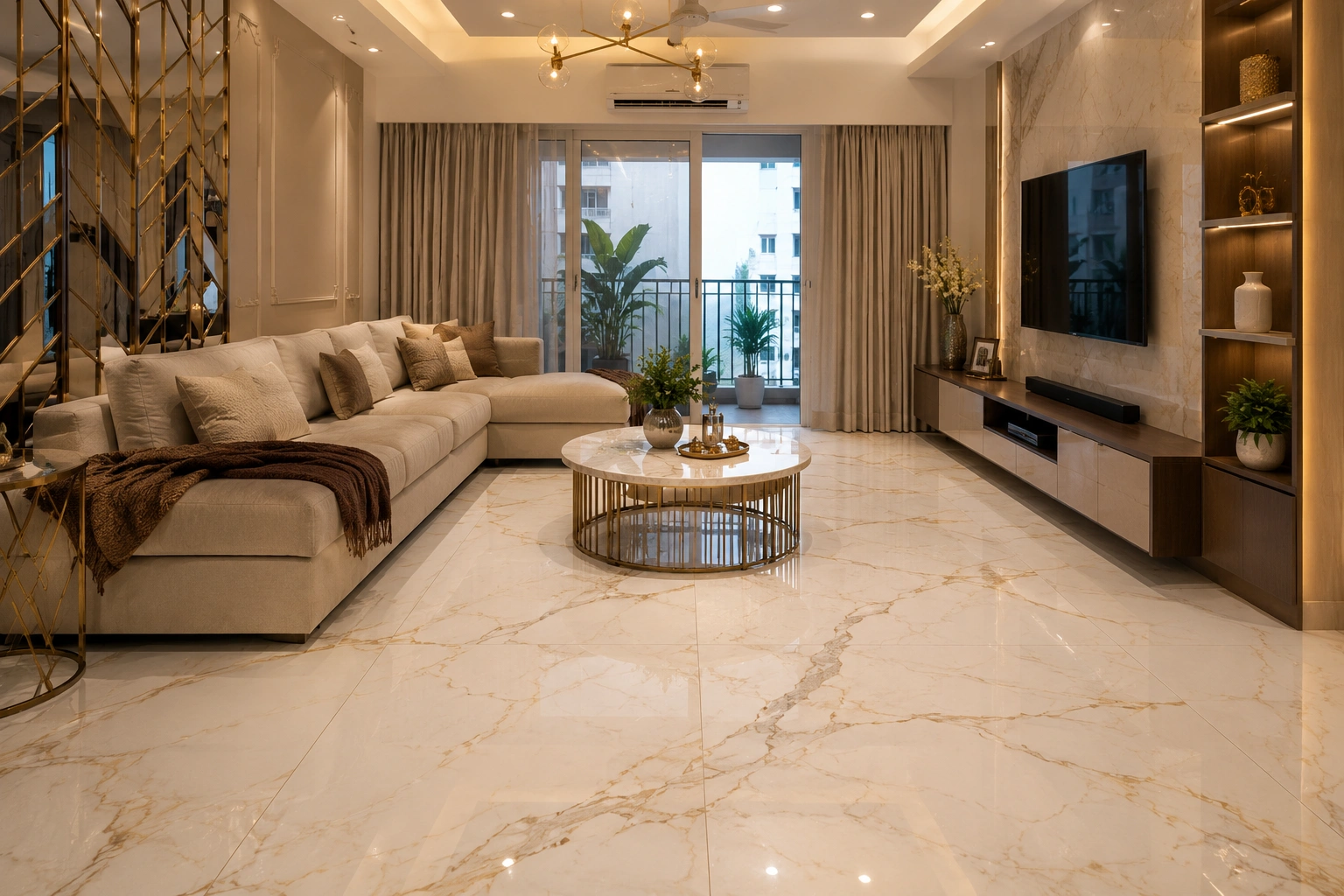
Statuario white marble-look PGVT in 800x1600 mm is the most specified design for Indian premium living rooms right now. The bold grey-black veining on a bright white body in a polished high-gloss finish gives the floor a brightness and formality that suits formal drawing rooms, large open-plan halls, and any living room where a statement floor is the design intention.
Category: PGVT. Finish: Polished High Glossy. Best for: living rooms above 180 sq. ft. with good natural light or well-planned LED layout. The polished surface amplifies both natural and artificial light. In rooms with a single tubelight or warm, dim lighting only, the reflective surface creates uneven bright patches. Pair with warm white walls (not cool white), warm brass or gold hardware, and off-white or beige upholstery to avoid the design reading as cold.
Grout: white or ivory, 1 to 2 mm joint. Price: Rs. 110 to Rs. 180 per sq. ft.
2. Calacatta Gold PGVT: Warm Marble for Indian Lighting
Calacatta Gold has overtaken Statuario as the preferred marble-look design for many Indian designers in 2026, specifically because of how it performs under Indian home lighting. Most Indian living rooms use warm LED panels at 3000K to 4000K. Under this warm light, the gold-brown veining of Calacatta Gold glows, and the cream-white base reads as warm rather than clinical. Statuario white under the same warm lighting can read slightly yellowish.
Category: PGVT. Finish: Polished High Glossy. Colour pairing: works very well with teak and walnut wood furniture, brass and gold hardware, and warm beige or cream walls. Grout: warm cream or beige, 1 to 2 mm joint. Price: Rs. 120 to Rs. 200 per sq. ft.
3. Arctic Grey GVT Posh: Contemporary Minimalist
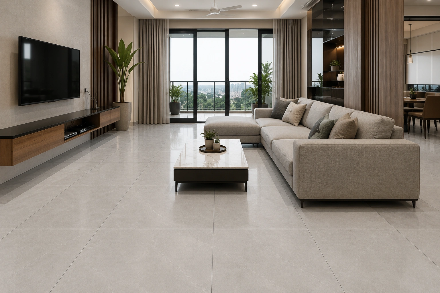
For Indian living rooms with a grey-white-black colour scheme, metal-framed furniture, and a contemporary minimalist direction, Arctic Grey in GVT Posh finish is the 2026 designer pick. The near-zero reflection matte surface creates a floor that reads as quiet and grounded rather than reflective and formal. No footprints, no watermarks, no smear-chasing after every mopping.
Category: GVT. Finish: Posh (near-zero reflection matte). Maintenance advantage over PGVT polished: significant. GVT Posh in this size handles daily Indian mopping and foot traffic without showing the way polished surfaces do. Colour pairing: white walls, black or charcoal accents, natural wood or grey upholstery. Grout: mid-grey, 2 to 3 mm joint. Price: Rs. 95 to Rs. 155 per sq. ft.
4. Beige Travertine GVT GHR: Practical Warmth
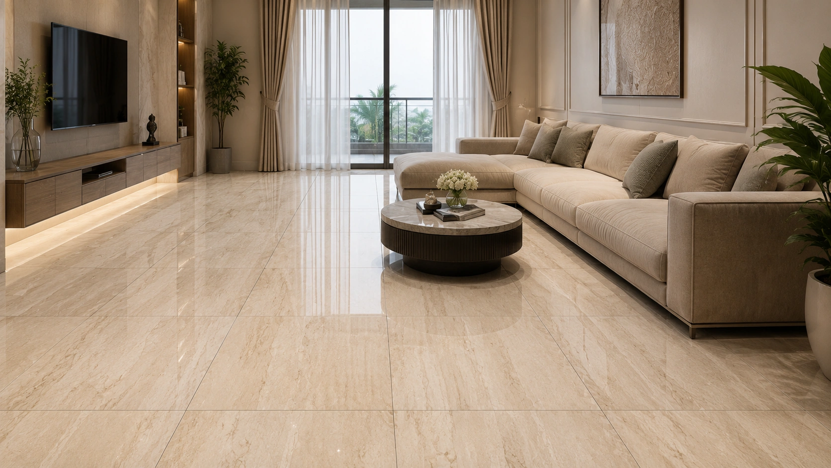
Indian living rooms in cities with warm climates (Chennai, Hyderabad, Bengaluru, Ahmedabad) often benefit from warm, earthy tones that soften the contrast between indoor and outdoor environments. Beige Travertine in GVT GHR finish brings a warm sandstone texture to the 800x1600 mm format. The stone-textured surface handles foot traffic and occasional moisture better than polished finishes.
Category: GVT. Finish: GHR (Glaze High Resistance). This finish is one of the most practical for Indian living room floors with heavy daily use, as it resists scratching better than polished PGVT. Colour pairing: warm wood furniture, natural jute or cotton upholstery, terracotta or copper accents. Grout: warm beige or sand, 2 to 3 mm joint. Price: Rs. 90 to Rs. 145 per sq. ft.
5. Bianco Carrara Full Body: Soft and Refined
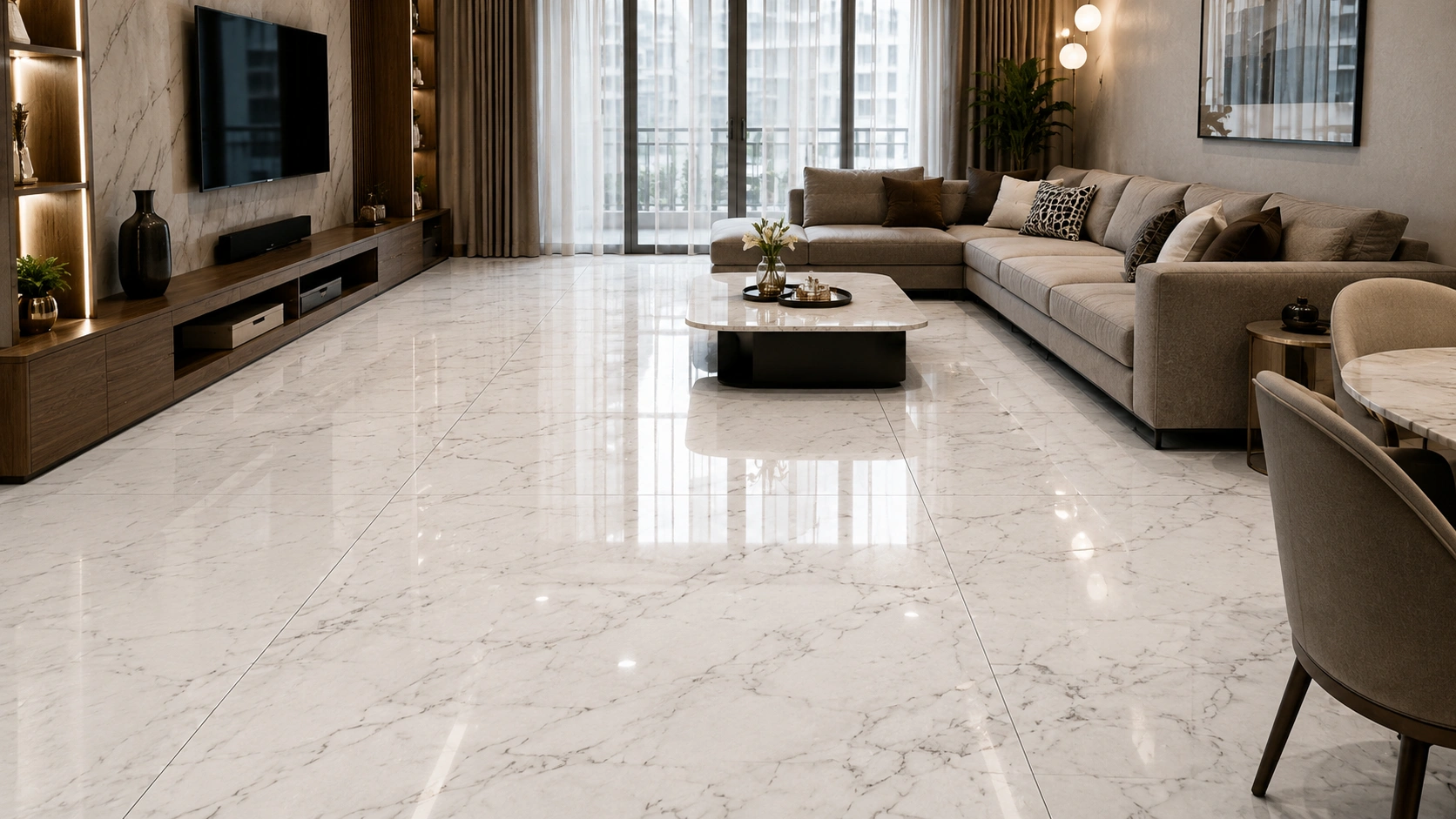
Where Statuario makes a bold statement, Bianco Carrara makes a quiet one. The soft grey feather veining on a clean white body in the Full Body category gives a refined, non-aggressive marble floor that suits Indian living rooms with mixed furniture styles, where one strong design element would clash with the rest of the room. The Full Body category means the tile colour runs through the entire thickness, so cut edges at skirting and door thresholds look clean rather than showing a plain white ceramic core.
Category: Full Body. Finish: Polished or Posh Matte. The Posh Matte option in Full Body is a growing preference among Indian designers who want the Carrara look with lower maintenance than polished. Grout: light grey, 2 mm joint. Price: Rs. 110 to Rs. 200 per sq. ft.
6. Wooden Plank Combination: Two-Zone Living Area
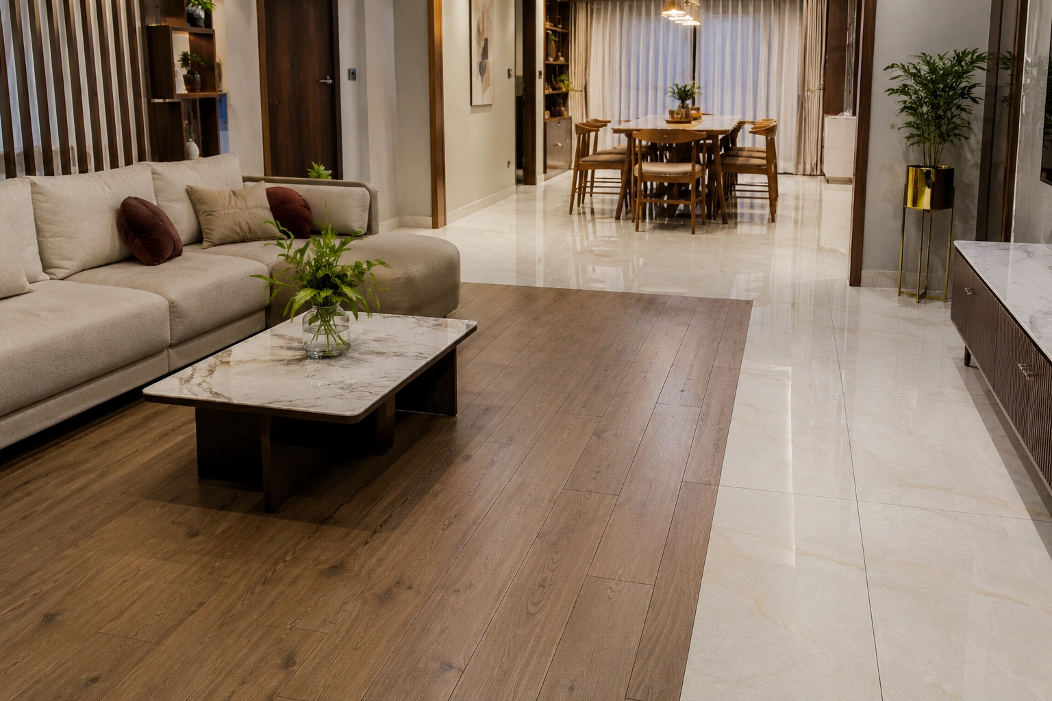
In open-plan 3BHK living and dining areas, Indian designers in 2026 are specifying 800x1600 mm marble-look PGVT for the main seating zone and 200x1200 mm (8x48) wood-look GVT planks for the dining zone or an adjacent study nook. The two zones are separated by a thin transition strip or simply meet at a door threshold. The warm-cool contrast between the marble-look floor and the wood-look area defines the zones without any physical partition.
This combination works because both GVT and PGVT are vitrified categories, and their subfloor, adhesive, and installation requirements are compatible. The grout lines of the two zones do not need to align because a natural transition strip sits between them. Both surfaces have similar maintenance requirements, which keeps the home's cleaning routine consistent.
Colour Combinations That Work in Indian Living Rooms
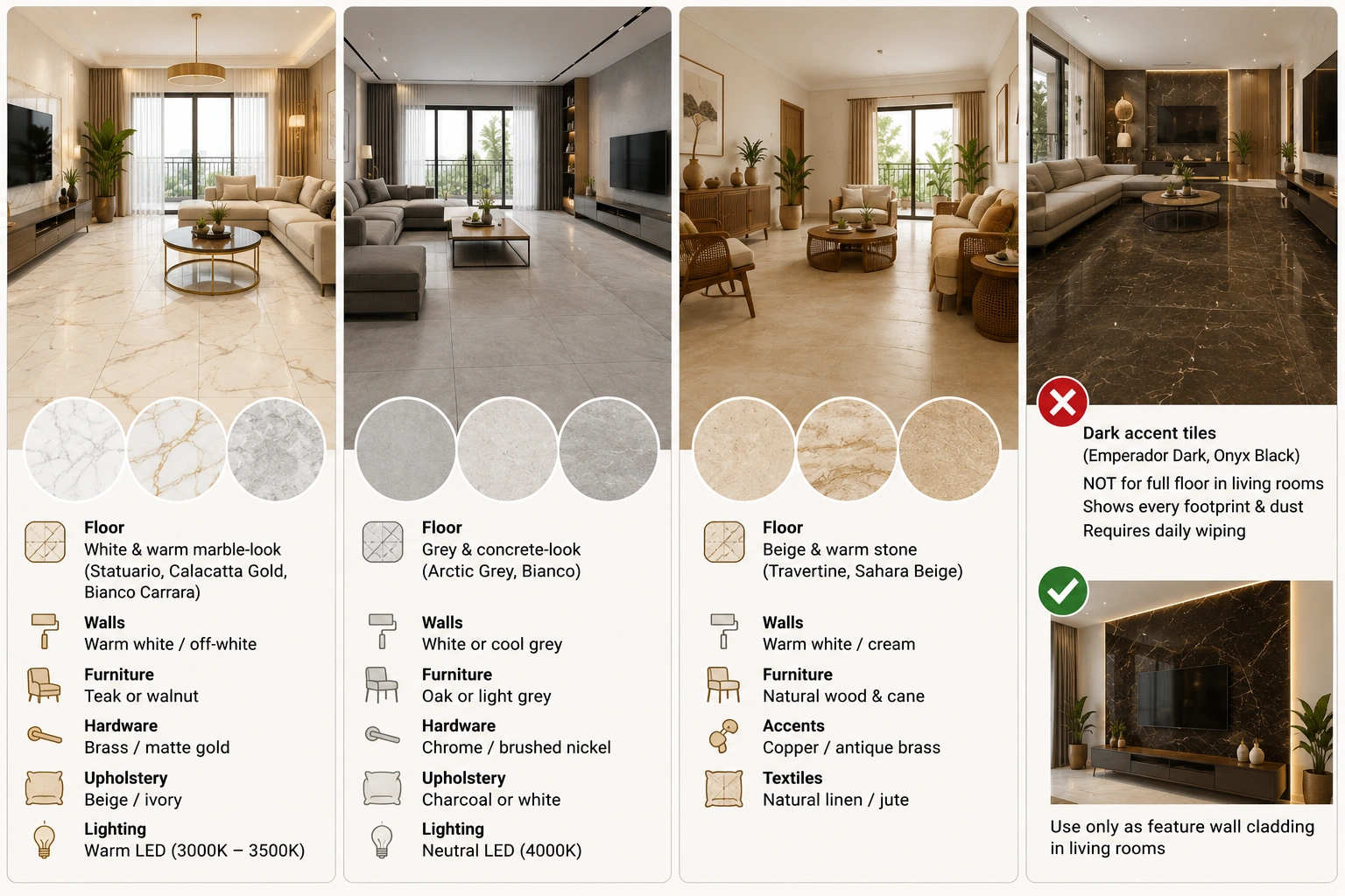
White and warm marble-look floors (Statuario, Calacatta Gold, Bianco Carrara) pair with warm white or off-white walls, teak or walnut furniture, brass or matte gold hardware, beige or ivory upholstery, and warm LED lighting at 3000K to 3500K. This combination is the most commercially popular in Indian premium apartments right now.
Grey and concrete-look floors (Arctic Grey, Bianco with grey walls) pair with: white or cool grey walls, oak or light grey furniture, chrome or brushed nickel hardware, charcoal or white upholstery, and neutral LED lighting at 4000K. This combination suits contemporary apartments in tech-professional households in Bengaluru, Pune, and Hyderabad.
Beige and warm stone floors (Travertine, Sahara Beige) pair with: warm white or cream walls, natural wood and cane furniture, copper or antique brass accents, natural linen or jute textiles. This combination is preferred by Indian designers working on homes that draw from traditional Indian craft and material culture in a contemporary way.
Dark accent floor tiles (Emperador Dark, Onyx Black) are used only as feature wall cladding in Indian living rooms, not as full floor finishes. Indian designers consistently advise against dark 800x1600 mm tiles on living room floors because they show every footprint and dust particle and require daily wiping to maintain their appearance.
GVT vs PGVT for Living Room Floors: The Honest Call
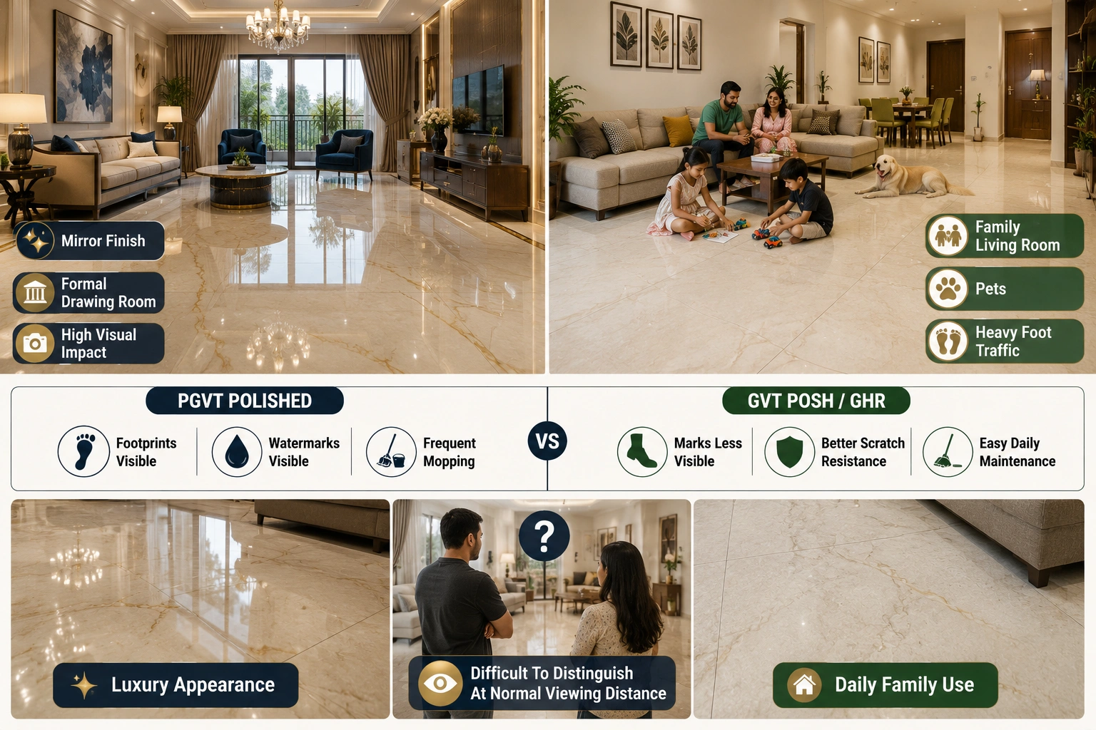
PGVT polished is the choice if the primary goal is visual impact and the room is a formal, relatively low-traffic drawing room. The mirror surface reads as luxury and photographs beautifully. The maintenance demand is real: polished PGVT shows every smear, footprint, and watermark and needs regular mopping to stay looking its best.
GVT in Posh or GHR finish is the choice if the living room is the daily family gathering space with children, heavy foot traffic, or pets. The matte surface hides daily marks, resists scratching better than polished PGVT, and handles Indian mopping habits without degrading the finish over years of use. The visual quality of GVT Posh in a marble-look or stone-look design in 800x1600 mm is very high in 2026, and most casual visitors cannot distinguish it from polished at normal living distances.
Indian designers are increasingly recommending GVT Posh finish for family living rooms and reserving PGVT polished for formal drawing rooms and feature walls where the surface is not walked on daily. For the technical category rules, including which areas PGVT must avoid, see the 800x1600 tile cutting and installation guide for Indian contractors, which covers the full category-placement matrix.
Grout Colour and Joint Width: The Details That Matter
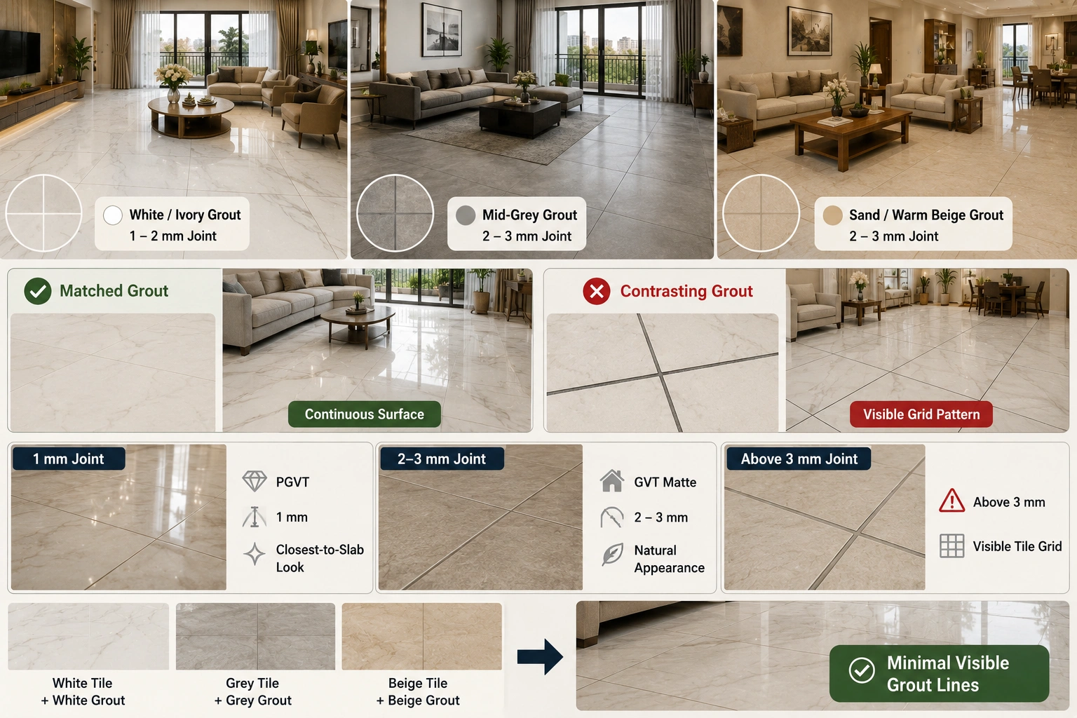
Grout colour is the single most underestimated decision in a tile installation. On an 800x1600 mm floor, grout lines appear every 1600 mm in one direction and every 800 mm in the other. With a matched or near-matched grout colour, these lines are almost invisible,e and the floor reads as a continuous surface. With a contrasting grout colour, the grid becomes a design element that can look very intentional or very dated, depending on execution.
For white and light marble-look floors: white or ivory grout in 1 to 2 mm joints. For grey concrete-look floors: mid-grey grout in 2 to 3 mm joints. For beige stone-look floors: sand or warm beige grout in 2 to 3 mm joints. Never use white grout with a dark floor or dark grout with a white floor unless the grid pattern is an intentional design choice you have previewed with sample tiles in your actual room.
Joint width matters too. 1 mm rectified joints on 800x1600 mm PGVT give the closest-to-slab appearance. 2 to 3 mm joints on GVT matte look natural and work with the stone-look character of matte finishes. Joints above 3 mm on 800x1600 mm make the floor look like it was tiled by a mason who was not confident in the format. Specify the joint width explicitly with your contractor before work begins.
What Indian Designers Are Moving Away From in 2026
Dark living room floors. Onyx Black and Emperador Dark on full living room floors peaked around 2021 to 2022. Indian designers now consistently steer clients away from dark full floors because of the daily maintenance burden and because they make standard Indian living room sizes feel compressed.
High contrast white-and-black grid grout. The combination of white 800x1600 tiles with dark grey or black grout was popular in the early large-format period. It reads as dated in 2026. Matched or near-matched grout is now the standard specification, and TilesFinders listings show that most current large-format tile installations follow this approach to achieve a more continuous visual finish.
Diagonal is 800x1600 mm. The diagonal pattern adds 15 to 18 per cent wastage on tiles that already cost more per sq. ft. than smaller formats. Indian designers have largely moved to straight lay and offset patterns for large format tiles and reserve diagonal for smaller mosaic and accent tiles.
Random mix of sizes in the same room. Using 800x1600 mm and 2x2 tiles (600x600 mm) in the same floor space (sometimes done to reduce waste from cut pieces) looks unplanned. If you have significant off-cuts from the main installation, use them in a utility area or store them as future replacement stock, not as a design element in the main living room floor.
FAQs
For a formal drawing room with lower daily traffic, PGVT polished high-gloss gives the most impactful look. For a family living room used daily with children or heavy foot traffic, GVT in Posh or GHR finish gives comparable visual quality with significantly lower maintenance. Indian designers in 2026 are increasingly recommending GVT Posh for daily-use family living rooms and reserving PGVT polished for formal drawing rooms and feature walls.
For Indian living rooms lit with warm LED panels (3000K to 4000K), whichares most 2BHK apartments, Calacatta Gold or warm beige stone-look designs work better than pure white Statuario. Under warm lighting, Calacatta Gold glows and reads as intentionally warm. Statuario pure white under warm lighting can read slightly yellowish or clinical. If your living room has good natural daylight for most of the day, Statuario white PGVT gives its best performance. Always check the tile sample in your actual room under your actual lighting before ordering.
GVT is more versatile and has lower maintenance. PGVT gives a higher visual impact but requires more frequent mopping to look its best. Both are available in 800x1600 mm from Indian manufacturers. PGVT is for indoor dry areas only: never for wet zones, balconies, or outdoor areas. GVT in matte, Posh, or GHR finish can handle occasional moisture and is better suited for living rooms that connect to a balcony or open courtyard, where some tracked-in moisture is possible.
Living rooms above 180 sq. ft. with at least one dimension above 3500 mm give 800x1600 mm tiles their full visual advantage. In rooms between 150 and 180 sq. ft., the format works,s but the visual gain over 600x1200 mm is smaller. Below 150 sq. ft., 600x1200 mm gives a large-format look with lower wastage and better cost efficiency. Run the layout calculation for your specific room dimensions before finalising the size.
The standard recommendation is to run the 1600 mm dimension parallel to the longest wall of the room. This reinforces the room's primary axis and creates a directional floor that reads as deeper and calmer. In a nearly square living room, landscape orientation (1600 mm horizontal across the width) is the default. Portrait orientation (1600 mm running away from the entrance) suits long, ng narrow rooms and creates an elongating effect.
White or ivory grout in 1 to 2 mm joints. The goal is for the grout lines to be nearly invisible so the floor reads as a continuous marble surface. Avoid contrasting dark grout with white tiles unless you specifically want the grid pattern as a design element, which is considered dated in 2026. For grey stone-look tiles, use a matching mid-grey grout in 2 to 3 mm joints.